Since CSS shapes are becoming more important to website development, I thought that a simple list of how to create the most common shapes was in order. You’ll find that most of these shapes are very simple to achieve and that they are not that complicated at all. However, at the same time, they will save you a lot of trouble.
CSS3 shapes
There are actually more advantages to using CSS generated shapes than simply creating something cool. However, a big advantage to using these is their replacement of images within a page. This provides you with two big wins, first it speeds up the load time of the page as big images can take forever to load and loading multiple images at the same time also slows everything down. Instead using a CSS3 generated shape to help speed up the site loading time. With the amazing capabilities of CSS3 in general, it will be easy to a create similar, if not the same, style effect you want as a photo editing software would to something simple like a badge or an icon.
There is, however, one more big advantage. As when you are creating a shape for navigation or a badge, the text will help with SEO. Text within images cannot be found by search engines as it doesn’t see and understand an image the way we do. However, actual text will be able to render the keywords and help your site be more SEO friendly. Also with using text comes a legal advantage for accessibility but that is a whole other subject.
Square
You’ve created more square, and rectangular CSS shapes than you can think of as any div is either a square or a rectangle. It is as simple as setting a width and height of equal value and providing a background that will make the shape visible.

[html]<div id=”square”></div>[/html]
[css]#square {
width: 100px;
height: 100px;
background: black;
}
[/css]
Rectangle
Just like I said, rectangles are nothing new for you as it is as simple as setting a width that is larger than the height or vice versa. It’s very possible that you’ve used more rectangles then squares given that a lot of website design elements are actually rectangular.

[html]<div id=”rectangle”></div>[/html]
[css]#rectangle {
width: 200px;
height: 100px;
background: black;
}[/css]
Triangle
In order to create a triangle, you have to manipulate the border property. It is a little bit weird as it is a hack but it does create a pretty neat triangle. Manipulating the border width property will provide you with a variety of different triangles at different rotational angles.

[html]<div id=”triangle”></div>[/html]
[css]#triangle {
width: 0px;
height: 0px;
border-style: solid;
border-width: 0 50px 50px 50px;
border-color: transparent transparent black transparent;
}
[/css]
Diamond
A diamond can be looked at in many ways. First, a rotated square; second, two triangles next to each other. The example below is the latter; as you can clearly see that you are first creating a triangle and then adding a second one.

[html]<div id=”diamond”></div>[/html]
[css]#diamond {
width: 0;
height: 0;
border: 50px solid transparent;
border-bottom-color: black;
position: relative;
top: -50px;
}
#diamond:after {
content: ”;
position: absolute;
left: -50px;
top: 50px;
width: 0;
height: 0;
border: 50px solid transparent;
border-top-color: black;
}
[/css]
Trapezoid
Creation of a trapezoid is a strange manipulation of a ‘heightless’ div border. The code is very simple and straightforward but I would call this shape a very neat trick.

[html]<div id=”trapezoid”></div>[/html]
[css]#trapezoid {
width: 100px;
height: 0;
border-bottom: 100px solid black;
border-left: 50px solid transparent;
border-right: 50px solid transparent;
}
[/css]
Parallelogram
Creation of a parallelogram is achieved by adding the skew property and setting the deg property.

[html]<div id=”parallelogram”></div>[/html]
[css]#parallelogram {
width: 150px;
height: 100px;
background: black;
-webkit-transform: skew(20deg);
-moz-transform: skew(20deg);
-o-transform: skew(20deg);
}
[/css]
Pentagon
Creating a pentagon is a hack too. There are actually two components that go into creating one. You are first creating a trapezoid and then adding a triangle to its top. This is a bit tricky but it works.

[html]<div id=”pentagon”></div>[/html]
[css]
#pentagon {
width: 54px;
position: relative;
border-width: 50px 18px 0;
border-style: solid;
border-color: black transparent;
}
#pentagon:before {
content: “”;
position: absolute;
height: 0;
width: 0;
top: -85px;
left: -18px;
border-width: 0 45px 35px;
border-style: solid;
border-color: transparent transparent black;
}
[/css]
Hexagon
A hexagon is a kind of a hot and hip shape in many designs today. There are actually many different ways to create a hexagon. The one below is similar to the pentagon as you are creating a rectangle and then adding two identical triangles one on top of the rectangle pointing up and one below pointing down.

[html]<div id=”hexagon”></div>[/html]
[css]
#hexagon {
width: 100px;
height: 55px;
background: black;
position: relative; }
#hexagon:before {
width: 0;
height: 0;
content: “”;
position: absolute;
top: -25px;
left: 0;
border-left: 50px solid transparent;
border-right: 50px solid transparent;
border-bottom: 25px solid black;
}
#hexagon:after {
width: 0;
height: 0;
content: “”;
position: absolute;
bottom: -25px;
left: 0;
border-left: 50px solid transparent;
border-right: 50px solid transparent;
border-top: 25px solid black;
}
[/css]
Circle
In all honesty, a circle is a square with a big border-radius property that ends up rounding the square to look like a circle. Manipulating the border-radius property will provide you with a circle.
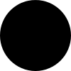
[html]<div id=”circle”></div>[/html]
[css]#circle {
width: 100px;
height: 100px;
background: black;
-moz-border-radius: 50px;
-webkit-border-radius: 50px;
border-radius: 50px;
}
[/css]
Oval
The same is true of an oval as it is of a circle; however, an oval is a rectangle not a square with a border radius that is half in height that it is in width – to accommodate for the rectangle base.
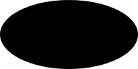
[html]<div id=”oval”></div>[/html]
[css]#oval {
width: 200px;
height: 100px;
background: black;
border-radius: 100px / 50px;
-webkit-border-radius: 100px / 50px;
}
[/css]
Your turn
I’m curious as to what shapes can you achieve now? Share your snippets in the comments and show off your ability to make amazing new shapes such as hearts or stars.
