To be honest some properties out there are a little ridiculous, CSS filters are one of them. They have an amazing capacity to transform images and webpages as a whole. That’s intense when you come to think about it, as some web browsers still can’t get border radius or @font-face right.
How to Use CSS Filters?
Using CSS filters is very simple, however let’s note that the syntax is not like a typical property. It’s still not rocket science but it differs from most values as a lot of the CSS filter values take in parameters. I promise, it does make sense. Let’s take a look at a graysscale example and it’s syntax.
[css]img { -webkit-filter: grayscale(50%); }
[/css]
First things first, there is a webkit prefix. Then, the value is defined with parenthesis and a parameter. Just about every single CSS filter has a parameter as it defines how much of a change to apply. If you take a look at the grayscale example above, the parameter defines that the image will only be turned gray 50%. If it said 100%, than the whole image would end up black and white. A good way to think about this would be to ask yourself “how gray do you want the image to be?” You get the idea; it’s basically the intensity.
The Various Types of Filters
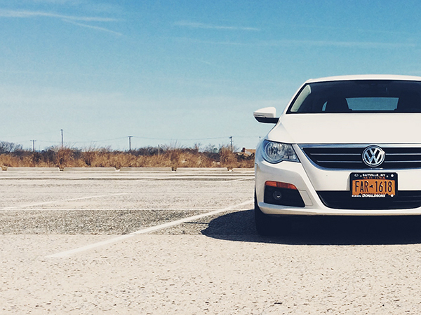
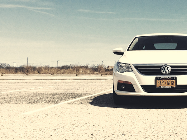
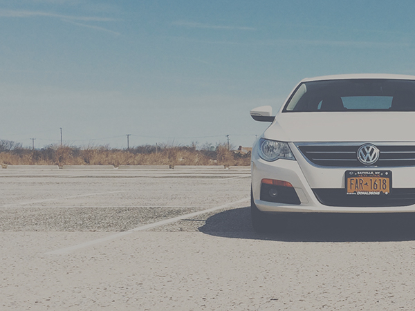
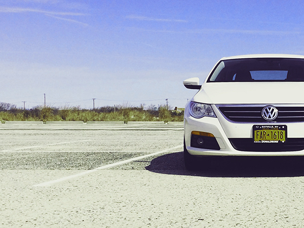
There are a lot of filters for you to choose from actually, some more common than others and some more useful than others as well. But for the sake of this article let’s go over as many as we can, to at least introduce you to the possibilities of CSS filters. Our demo image for today is this awesome picture of a Volkswagen CC I took a little while ago.
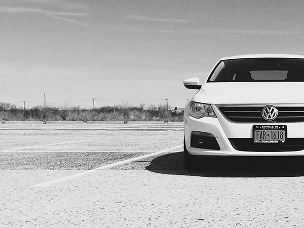
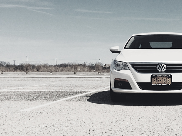
Grayscale
I have just mentioned grayscale. It turns an image black and white. The percentage ranges from 0% to 100% where 0% is no filter added and 100% is the whole image is fully black and white. I suppose you can also think of the percentages here as the black and white opacity over the image, how visible the grayscale you’d like to be.
[css]img { -webkit-filter: grayscale(100%); }
img { -webkit-filter: grayscale(50%); }
[/css]
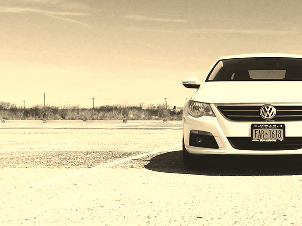
Sepia
I’m not sure if anyone really applies this type of effect to photos anymore but if you are looking to use it, there you have it. This western style filter can be applied in the same manner as the grayscale with a percentage range between 0% and 100%. You determine how much of the effect you’d like to apply by picking a specific percentage.
[css]img { -webkit-filter: sepia(100%); }
img { -webkit-filter: sepia(50%); }
[/css]
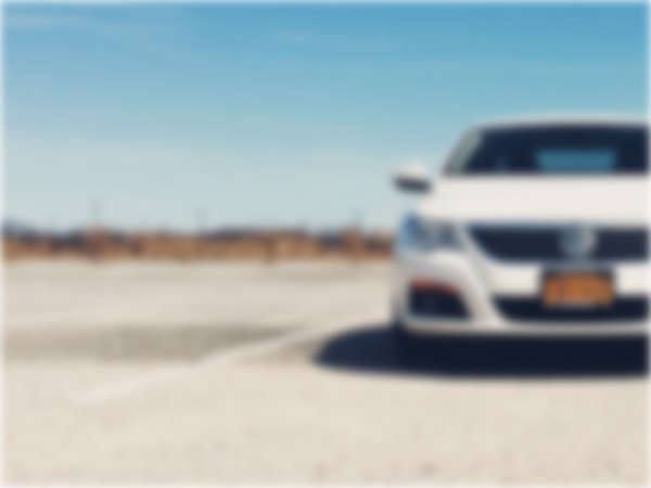
Blur
The blur filter works very similarly to Guassian blur you have in Photoshop. By setting a specific pixel amount you are defining the blur amount. The higher the pixel amount, the bigger the blur will be. The parameter taken in this CSS filter is a pixel not a percentage.
[css]img { -webkit-filter: blur(10px); }
img { -webkit-filter: blur(50px); }
[/css]

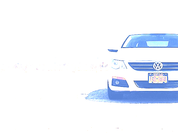
Saturation
If you know a thing about color theory you know that saturation defines how vivid colors are. Unlike the previously mentioned CSS filters – grayscale and sepia – saturation doesn’t have a range, you can specify practically anything like 200% or 2000%; the higher the number the more intense the colors. The range between 0% and 100% dulls the colours; an image by default has a saturation of 100%.
[css]img { -webkit-filter: saturate(20%); }
img { -webkit-filter: saturate(200%); }
img { -webkit-filter: saturate(2000%); }
[/css]

Contrast
This is a filter that’s very similar to saturation. You don’t necessarily have a max-range as you can specify anything. The range between 0% and 100% is basically how dull you want your image to be and anything above 100% is how intense you’d like the contrast to be. Like saturation, elements are by default set at 100%.
[css]img { -webkit-filter: contrast(50%); }
img { -webkit-filter: contrast(500%); }
[/css]
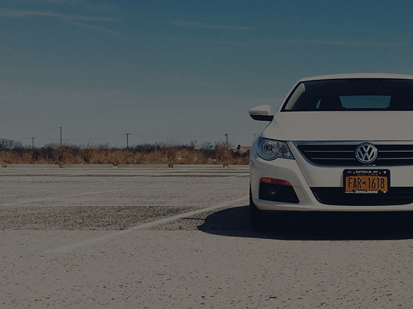
Brightness
This CSS filter is the last of these three that go hand in hand. Brightness works exactly the same as contrast and saturation. The image between 0% and 100% determines how dim you’d like to be. Of course by default every image is set at 100% too. You can then specify how bright you want it to be by setting any percentage amount over 100.
[css]img { -webkit-filter: brightness(50%); }
img { -webkit-filter: brightness(500%); }
[/css]
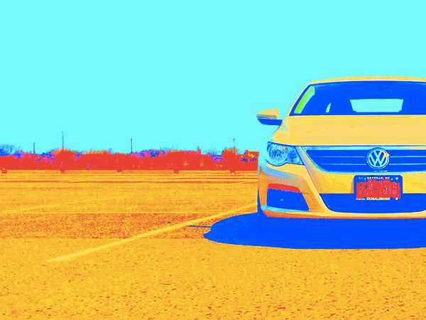
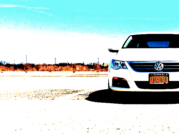
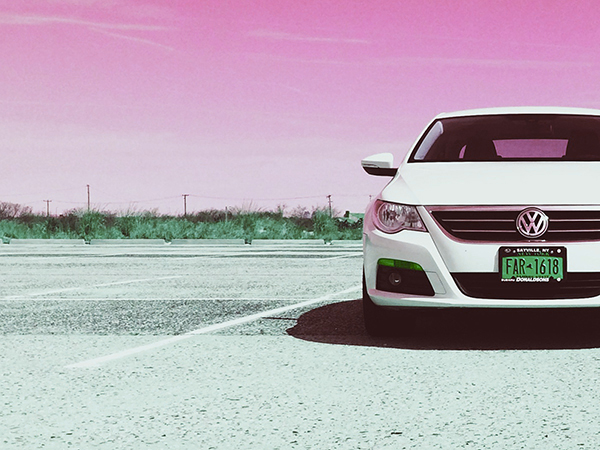
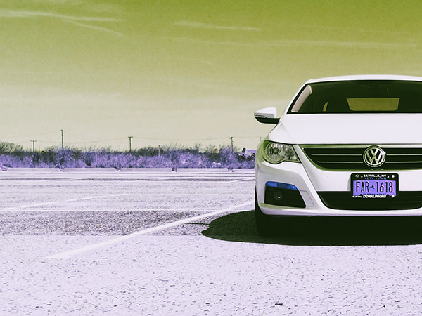
Hue-rotation
This is an interesting CSS filter as it takes the color wheel and, based on the degree you tell it, it rotates the colors of your image. A color wheel, like all circles, goes from 0 degrees to 360, you simply pick a spot within this range and the hues change.
[css]img { -webkit-filter: hue-rotate(45deg); }
img { -webkit-filter: hue-rotate(120deg); }
img { -webkit-filter: hue-rotate(240deg); }
[/css]
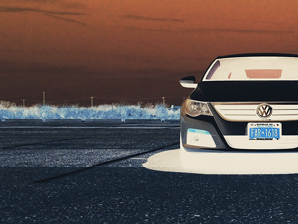
Invert
Like the name suggests, this filter inverts the colors of the image. It works the same way as grayscale with a range between 0% and 100%. All you have to do is determine how much of the effect you’d like to add to your image.
[css]img { -webkit-filter: -webkit-filter: invert(100%); }
[/css]
The Limitation of CSS Filters
So there are a few caveats with these CSS properties, one of them being these filters are poorly supported by browsers. As you saw in all of the examples, every single example had a –webkit prefix. As you can imagine, only webkit browsers support this property. It’s a shame, I know. So currently, only Firefox 34, Chrome 7 and Opera 20 support this. However, some mobile browsers do too such as Safari on iOS 7, Android Browser 4.4, Blackberry Browser 10 and Chrome for Android 33. Okay so the list is actually not that bad but these are the only current version. All previous versions of the mobile browsers did not support CSS filters. Bummer.
Load speeds
The second caveat is the fact that load time can be significantly affected. CSS filters can be applied to multiple elements, not just images. Images are, however, the easier way to demo this property. So, the more of these you add the slower your website will be. This is more so than other properties as it manipulates elements in a very complex way, wouldn’t you agree?
Usefulness
The third and last caveat is that I’m not sure how useful this property actually is. I do think it’s great we can do this, but because of its terrible support and poor effect on load time, it’s still so much simpler to just open up Photoshop and recolor the image. No? By all means, this type of advanced editing in browsers is magnificent, but I don’t think the technology – specifically – support is there yet.
The More You Know
Now that you know what these properties are all about, I hope you can appreciate their ridiculousness as much as I do. It’s a great step forwards in terms of what HTML, CSS and our browsers can do for us.
