Well, when it comes to CSS, understanding the box model is very important. This is why you have this short, sweet and simple post at your disposal. It basically means that every HTML element is actually a box which consists of width, height, padding, borders, and margins. Now let’s discuss what this means exactly.
The box model
Every element on a page is, in fact, a box, whether or not it has a set width or height. I think that this is nothing shocking to you but it is something to keep in mind in order to understand what the box model is. I don’t think the box model is a hard concept to comprehend but it is a bit odd to get a grasp on.
What’s to it?
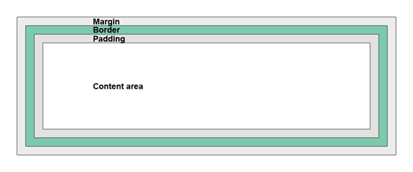
Take a look at the image above. You can find it at W3 school’s website. It is a visual explanation of the box model itself. First, you have the content area. It is set by the width and height of an element, whether or not it is actually specified or taken in by default. Then, you add padding around the content area, followed by a border and a margin to have the content’s full size.
Determining the full width and height
Now you know that the full size of an element is not restricted to its set height and width. Let’s figure out how the math works. Here is the formula for figuring out the total width of any element:
Total width: width + left padding + right padding + left border + right border + left margin + right margin
The formula for figuring out the height is pretty much similar:
Total height = height + top padding + bottom padding + top border + bottom border + top margin + bottom margin.
Below is a simple box shape whose measurements we will be using as an example.
[css].box{
width: 250px;
height: 100px;
padding: 10px;
border: 5px solid gray;
margin: 10px;
}
[/css]
Alright, so following the two formulas let’s figure out the actual width and height this element takes up.
Total width = 250px + 10px +10px + 5px + 5px + 10px + 10px = 300px
Total height = 100px + 10px +10px + 5px + 5px + 10px + 10px = 150px
It may seem complicated, but as you can see it really isn’t.
The details
Width and height properties
The width and height are exactly what they seem – they define the height and width of an element. They are not a mystery at all, however, as I’ve already pointed out, the width and height are the meant to be the total width and height of a given element if the element also has set padding, borders and/or margins.
How to use them?
Setting the width and height of an element is plainly easy. Just give it a number and a measurement type and you’re set.
[css]width: 50px;
height: 100px;
[/css]
Padding property
Padding is the property which defines the space between the element’s content area and the element’s border. It takes on the background of the element’s default set background so that it creates an illusion of greater content area where the text has some room to breathe. It is a really nice property actually that comes in handy in creating separation for texts and, like I just said, providing some space so that the text is not entrapped side to side.
How to use it?
There are four values that can be set in order to add padding. There are four sides to every element,: top, right, bottom and left –in that order. You set those up individually – thanks to padding-bottom property – or all at once – thanks to the padding property.
[css]padding-top: 5px;
padding-right: 6px;
padding-bottom: 7px;
padding-left: 8px;
padding: [top] [right] [bottom] [left];
padding: 5px 6px 7px 8px;
[/css]
When you want all of the four sides to have the same padding just identify one number within the padding property like in the snippet below. What this does is assume you mean the 5px to identify all sides – which you do.
[css]padding: [all sides];
padding: 5px;
[/css]
However, there is one other combination which is if you want both the top and bottom to have one size and right and left to have another. What you do is first identify the number for top and bottom because top comes first in the ‘top right bottom left’ sequence and then a number for right and left. Just like with the 5 pixels above, the property will take it that you mean the first number to be for top and bottom and the second number to mean right and left. These two tricks are amazing lifesavers.
[css]padding: [top-bottom] [right-left];
padding: 5px 10px;
[/css]
Border property
Border property is an interesting one. You can set its width, its style – i.e. solid or dotted – and its color. You can do a lot with a border now thanks to CSS3. A border property is exactly what it is called: it borders around both the content area and the padding of a given element to provide an outline. There are many uses for a border property from a simple outline to a bunch of visual tricks. However, that’s another story.
How to use it?
Unlike the other properties we’ve discussed thus far, the border property is a bit different. It takes three different values, a size, a style and a color. You can set these individually or all together under the border property similar to that of the padding property but not exactly the same. Take a look below to see what I mean.
[css]border-width: 5px;
border-style: solid;
border-color: red;
border: [border-width] [border-style] [border-color]
border: 5px solid red;
[/css]
Margin property
The last in line is the margin property. It adds space around all of the previously mentioned properties, width/height, padding, and border. It is actually empty space that you cannot customize other than its size – kind of like padding but it is see-through if you will. The interesting thing about margins is that it is technically not considered part of a box-model formula for determining the overall width and height of an element. However, you should ALWAYS include it anyways as it is, in fact, part of the size an element takes up. Especially because it is ‘invisible’ it is hard to see where one element ends and another begins which can greatly screw up your layout. Just add it into the formula ‘just in case’ and you will be grateful that you are not scratching your head wondering what went wrong.
How to use it?
The margin property works the exact same way as padding. You can set the measurements individually to all four sides, you can set the same measurement for all four sides at once or you can set a measurement to be the same for both top and bottom and both right and left.
[css]margin-top: 10px;
margin-right: 9px;
margin-bottom: 8px;
margin-left: 7px;
margin: [top] [right] [bottom] [left];
margin: 10px 9px 8px 7px;
margin: [all sides];
margin: 10px;
margin: [top-bottom] [right-left];
margin : 10px 5px;
[/css]
Why should I know this?
Understanding this concept is key to being able to manipulate HTML and CSS page layout and therefore create good looking and functional designs. Given that the box model is the basis of how elements work with one another it is also the basis of being able to manipulate them with ease. It will also help you trouble shoot layout issues when you run into them – because you will run into them.
