How to Create a Color Palette
Great color can be a key part of your next design project. Selecting a color palette can be an almost overwhelming decision. What colors to choose? How many? What kind of mood will color create?
There are almost as many answers as questions. But here are some guidelines to help you get started.
Number of Colors



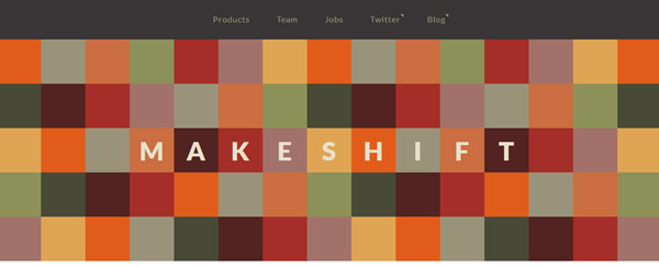
Working with too many colors can be quite tricky. Using too many colors can also result in a palette that looks like there is no palette at all.
So defining a few colors and using variants of those is the best option.
Three to five colors are common and ideal. Further, each color should have a purpose in the overall design scheme.
Each color palette should include one or two primary, or base, colors. (If you use online tools, you will be asked to pick one base color.) These are used for large segments of the design – backgrounds, logos, and major design elements. Next are one or two secondary colors, which are used frequently but less than the primary colors. Finally, each palette includes a true accent color, which is used in small spaces – often for highlighted or bold text or for small items such as bullets and lines.
Types of Color Palettes





The idea for most color palettes starts with the color wheel.
Colors are paired by position on the wheel to create schemes with different feels – harmony, conflict, happiness, trust. Positioning on the color wheel is key when making these color choices, and many palettes fall into one of several categories – monochromatic, analogous, complementary, split complementary or triadic.
Monochromatic: A color scheme that is made from a single hue. The hue can be mixed with white and black to create darker and lighter variants of the same color. This is the easiest type of color palette to create because you can’t mismatch a single color.
Analogous: A color palette created from colors that are located next to each other on the color wheel. This is another easy palette to create and often designers use a variety of tints with analogous schemes.
Complementary: A color palette made by combining colors from opposite sides of the color wheel. A basic complementary color scheme only contains two colors and tints. Despite the name, using opposite colors can sometimes be jarring to look at and these color palettes can create a sense of conflict for those looking at it.
Split complementary: A color palette that uses a base hue and then colors next to the opposite color on the color wheel. These palettes start with three colors – the base and two other hues – and are often quite visually appealing.
Triadic: A color palette consisting of three base colors that are equally spaced on the color wheel. This style of color scheme often showcases the broadest range of color and can sometimes be difficult to match.
Custom: A color palette that does not follow any real set of rules. While many color palettes fall under one of the categories above, some color schemes rely on an almost random look when it comes to color choice.
Adding Neutrals
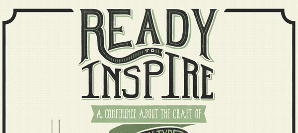
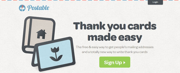
Depending on how many colors a palette contains and the nature of those colors, the addition of neutrals may be necessary. Many designers use a neutral for backgrounds or shading and not as a part of the rest of the design.
Neutral colors are those that mesh with almost any other combination of colors – gray, black, white, pale browns, tans and off-white.
Black and white are the most common neutral colors. So common, in fact, that they are seldom included in the development of a color palette. Black and white are the most popular colors for type and accent marks, such as lines and bullets.
Neutrals can be used to create a complete color palette as well.
Shades, Tints and Tones

Shades, tints, and tones refer to the addition or subtraction of color from a pure hue to create variants of the color. By using these alterations, a simple color palette can expand into a variety of options, including light, bright and dark colors. Shades, tints, and tones are an essential part of creating a monotone color palette.
Shades are colors that have black added to them to create a darker color.
Tints refer to colors that have been mixed with white to create a lighter hue.
Tones are variations of hues that have been mixed with gray for a less saturated effect.
Inspiration
So where does the inspiration for color come from?
Almost anywhere.
For brands, color palettes are typically already set when it comes to design projects. Pepsi, for example, would not create a new website and neglect to use its famous blue and red as part of the design.
But the inspiration for a great color palette can be more fluid as well. They can come from nature (earth tones, greens and blues), photos and even your mood.
Tools to Get Started
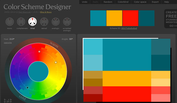
When creating a color palette for the first time (or even 100th for that matter), having a few great tools at your disposal can help. Here are three great tools to help you build the perfect palette.
Color Scheme Designer: One of the most visual color palette tools out there, allowing users to create a variety of color palettes and preview them live in both dark and light color environments. Color Scheme Designer has a beautiful interface where users create a palette with a base (or primary) color and up to four other colors, with values provided as RGB and hex values, plus exportable data. The tool has options for a variety of different types of color pairings and even options for color blind and random palette generation.
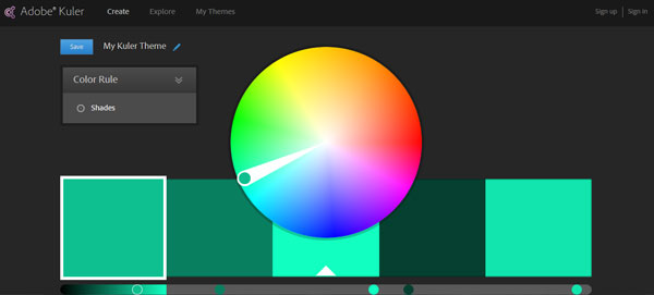
Adobe Kuler: With a recent redesign and launch of an iOS app, Kuler is leading the way in generating custom color palettes on the fly. The tool is easy to use, intuitive and works with Creative Cloud software. The tool lets users create a color palette using up to five colors by type and provides RGB and hex color values. Plus the app also allows users to snap photos to create and save palettes.
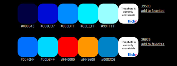
Color Hunter: Upload your favorite image and the tool will create a customer color palette for you. Each color palette contains five colors and hex values.