Key Elements to Help You Make Your Landing Page Successful
The purpose of all landing pages is to bring in as many visitors as possible and convert as many of those as well. There are many different things that can affect the success of a landing page; however, some basic things have been proven to help landing pages in general. This is where this post comes in – I’m here to tell you about these basic general things that will help your landing page shine; I promise this is not rocket science.
Keep it to the point
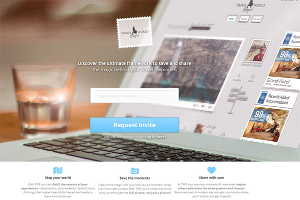
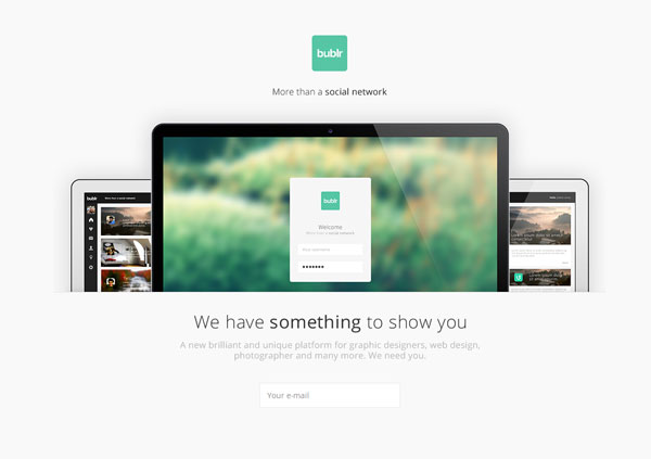
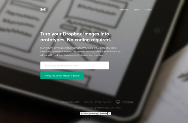
It most important for your landing page to be to the point, above all else. Why? Because this page is made to convert users – to get them to sign up, to sell to them, etc. If your page doesn’t do that, it will lose people’s interest incredibly fast, which defeats the purpose of having this page to begin with. People don’t like to read, they don’t like to sift through a pile of information online at all. If they came to your landing page, they came there for a reason so you should present their desired information front and center and nothing else. You should always highlight what the value of the landing page is. Your landing page should clearly and successfully convey to your visitors what your offer to them is, by using clear headings, bullets, clear call-to-action and by keeping things simple.
There are many things that could take your landing page off its point. There are three things in particular you need to watch out for – your content needs to be decluttered to its utmost essentials, your headline should be visible and strong and so should your CTA (call to action) be too. Let’s go over those in a little bit more detail, one by one.
Get rid of clutter – visual and content
When it comes to the content, keep things as brief as possible. Landing pages are meant to convert not to keep busy. People don’t have great attention spans online so overwhelming them with a giant amount of text or extreme amounts of imagery will scare them. According to a study by HubSpot, having too many images doesn’t help conversions because they distract users rather then help to convince them to convert.
Make your headline stand out
On many websites, users just flip through the pages – one certain way to get their attention and to get them to stay is through a great headline. A headline is something most people see and even read because it is a big element on a page and it also provides an overview of what the page is about; this, in turn lets the user know whether this page is something that is worth them checking out or not. Therefore, your heading should be spectacular in proving value as to why the users should stay on your landing page. Not to mention, the headline should not be lost within the page’s content; it should be big and bold so that it stands out – so that it is obvious it’s the headline.
A strong Call to Action
A call to action is to tell users what to do on a page. Not having one is just as bad as having a poor Call to Action – it’s like shooting yourself in the foot. Your overall Call to Action message should be friendly and encouraging; the action itself can vary on what they user should do but it should nonetheless be an action. Encourage your users to sign up, or purchase a sample. But, whatever you ask your users make sure it is easy for them to do – the easier the action the more people will follow through with it, you can’t ask people to jump through hoops for them, it just doesn’t work that way online.
Prove yourself
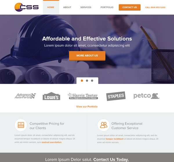
Users and visitors are skeptical online – especially If they have never used you before. So, prove yourself by providing testimonies, case studies, media quotes, client logos or social media proof. This will provide credibility and trust for you, which is so important and valuable. Without credibility, you don’t’ get too many conversions – this can only help you. If you can include Tweets or Facebook posts by your current customers your credibility – as well as your conversions – will go through the roof.
Be consistent in layout
Landing pages should always be A/B tested for most optimal conversions and maximum results. However having too many, too drastic changes can hurt your conversions. Page layout has the most impact on a landing page’s performance therefore consistency should be kept so that users don’t get confused while navigating your page. When users don’t know how to get around your page, they simply leave.
Test, always test
Just like many thing in this industry, landing pages vary so it depends what will help one over the other the most. However, the way to figure out what will help your page best, at the end of the day, it to test and test a lot. Of course don’t go overboard as the last thing I pointed out – consistency in layout – will be compromised but just make sure you try out different things on your page to truly know what works for your page and what doesn’t. A/B testing is so simple nowadays; it’s just silly not to do it – especially on such an important page as a landing page. A/B testing your page will narrow down whether your Call to Action button should be green or blue, whether the headline is too big or too small or whether or not the current graphic you have on there helps at all.
Conclusion
I hope these few tips will help out your pages as these are some very simple and basic rules every landing page should follow. I’d like to think that these element are kind of obvious actually as it doesn’t take a lot to make a landing page successful – you just have to make sure that it is, in the end, clear and to the point so that it is easy for your users to convert.
