The Poor UX of Social Sharing Buttons and Why You Should Drop Them
How many times have you compromised the sleek and beautiful design of a website for the sake of social integration? I bet this is not a new dilemma for a web designer.
There is always a fight between digital marketers and web designers on reaching a solution that works well enough for both parties. And quite often that solution means having those colorful social media sharing buttons on each and every page of the website.
How did we ever get used to this at all?
Let’s see.
In the early stage of the social media boom these buttons played a significant role in social media marketing. They were thought to be an easy and comfortable way for the user to share your content and be reminded that you are active on social channels and eager to connect. This was a great deal and something that most of the websites opted for. It was easy, trendy and seemed to be harmless. After all, if Mashable has those buttons, that must be a good thing.
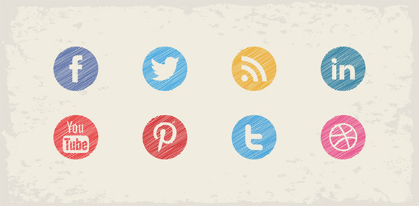
Not surprisingly social media buttons became kind of a default prerequisite of a website, regardless of its purpose. You have probably come across social sharing buttons in places where it is not only unnecessary, but even ridiculous. This happens when Facebook like and tweet buttons are built into the footer and appear on every page of a website.
Why would anyone want to Like or tweet a contact form?
Well, Okay, but Do These Buttons at Least Work?
To tell the truth this heavily depends on the type of website and the user profile. It’s not that social sharing buttons are useless, but we have to understand how often people use them for sharing content. Obviously I am not the first one to ask this question and there is even some data to analyze and draw conclusions.
British government website gov.uk did a little experiment to understand how their users engaged with social sharing buttons and here’s what they found out.
“During the time period we analysed, GOV.UK URLs were shared a total of 14,078 times to Facebook and Twitter using our sharing buttons – that’s 0.2% of the total of 6.8 million pageviews.
Overall, our social sharing rate was 0.2%.” Source
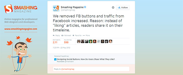
This is really alarming, but let’s not forget that gov.uk is a governmental website. Will the numbers be as low for entertainment and news websites? Well, here’s what Smashing Magazine has tweeted about their own experience with the social sharing buttons.
“We removed FB buttons and traffic from Facebook increased. Reason: instead of “liking” articles, readers share it on their timeline.”
Surely, click through rate is a quite solid metric to evaluate the value of social buttons, but it would make sense to put it together with some user research data to have a more deep understanding of the reasons behind such low conversion rates. This especially refers to such entertainment websites, where users are more likely to share content via buttons.
So the effectiveness of social media buttons heavily depends on two things:
- How many people actually use those buttons?
- Who is the user sharing through those buttons?
What About User Experience?
It is difficult to decide whether to keep or eliminate social media buttons, because there will always be at least a tiny percentage of people using them. And it is easy to get caught up thinking that having those buttons doesn’t cost you anything, so you may keep them just in case someone wants to use them.
But everything is not that simple. If you analyze the actual user experience of sharing content through social media buttons, I am sure you will seriously question their existence on your website. Here’s what I feel about it.
-
Slow Loading.
It is no big news that social widgets tend to slow down the loading of the website, because they increase the amount of data that is downloaded on each web page. The delay in loading may be different for each website, but today every second counts and users are too impatient to wait extra time. This becomes even more annoying for users with smaller bandwidth and it adds up for a bad UX.
-
Too Much Noise.
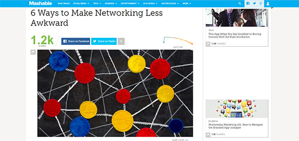
The webpage space is limited and every inch of it needs to be meaningful for the user. But this doesn’t mean you need to fill it up with sales messages, banners and tons of tools that nobody cares about. Good user experience is about reducing noise and increasing focus on the content, which users came for. Social media buttons create noise and distract the user from his primary focus. In fact the social widgets that show the number of shares through each social networking website create even more frustration for the user. Well, if it’s Mashable and those numbers show thousands of tweets, +1s and Facebook shares, that’s perfect. But for the rest of websites, there may be one or two social shares through those treacherous buttons, which degrades credibility and reduces the motivation to share.
-
The Awkward Popups.
Popup is an old and non-usable UI pattern that is thankfully vanishing from most websites. The popup experience is rather awkward and interferes with the user’s sense of flow as they browse a website. And what happens when you click on a Facebook or twitter share button? You get a popup with some weird text and formatting that you usually have to edit over again before posting.
-
Poor Mobile Experience.
Trying to share through social buttons on mobile is even worse. Instead of a popup you are thrown onto a new webpage, where you have to login and then share the same weird stuff with a slower connection and a smaller screen.
So How Can You Optimize the Usability of Social Buttons?
If you have the courage and of course supporting data, I suggest eliminating social media buttons altogether, leaving more white space and improving focus. For the rest of web designers and webmasters who are worried that social media marketing may greatly suffer without social buttons, I suggest a couple of alternatives.
- Run some A/B tests with different designs, sizes and placement of social buttons and see which one generates higher CTR. It would be even better to do some benchmarking with fellow websites to understand the averages for the industry.
- Talk to your users and understand their motives to share content and reasons why they do not share through social media buttons. This will give you clues on whether or not to drop them at all.
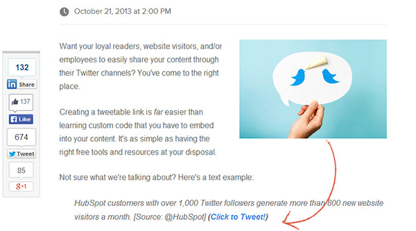
- Try to integrate social sharing experience into your website in a brand new way. Think out of the box. You may get inspired also after interviewing a group of your very own users. For example, you may want to incorporate a twitter button into the copy and highlight specific quotes or statements that you think are really worth sharing.
Final Thoughts
I believe that social media buttons are eventually going to vanish, just the way most of them have already disappeared (like digg, delicious, etc). After all, users do not come to your website to connect with you on Facebook or Twitter. If they want to share your content, they’ll find a way to do it (obviously just copy and paste the URL). If not then the shares of those users probably won’t grow your audience anyway.