The UX Challenges of Smart Watches
Why would you buy a smart watch? This is a question that still remains unanswered for me although dozens of brands keep promising that it’s something truly innovative and “smart”. Well, I don’t see it that way, but today it’s not my buying preferences that I would like to discuss.
Smart watches are likely to stay around for a long time, so I think it’s high time to talk about the actual customer experience and usability that these devices have to offer.

A wristwatch is first of all a fashion accessory, so it is somewhat difficult to evaluate its usability, but not when it claims to be a smart gadget with a completely new user interface. Overall, smart watches are just an extension of your smart phone that have a minimal functionality limited to:
- showing incoming calls and letting you accept or decline them
- showing various notifications
- fitness tracking
- telling time
Surely smart watches of different brands have lots of other features not listed above but that’s nothing more than your smartphone can do. Anyway, smart watches become a new communication medium and as a user interface it has to be comfortable and easy-to-use.
So what are the main challenges of a smart watch user experience?

Small Screen Size
The limited screen space is one of the biggest disadvantages of a smart watch. It is also the only issue that probably won’t ever be solved, because you’re not going to wear a smartphone on your wrist, are you? The small screen size brings up a number of usability issues among which are accessibility issues, readability and interaction problems. The challenge is to design a beautiful and sleek user interface while also making it readable and fully comprehensible.
The problem with most of the current devices is that they have basically the same interface as a smart phone shrunk to the size of a wristwatch, which makes it more difficult for the user to navigate and actually use the device. If this is a truly innovative device that has the potential to change the way we use our smartphones on a daily basis, then it also needs a new and innovative interaction method that will embrace the pros and cons of the small watch screen.
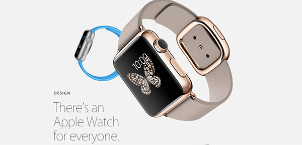
Apple’s attempt to introduce a new way of interacting with the device was not perfect, but at least they’re on the right path. The small nub of the watch, aka “digital crown”, solves part of the problem by enabling users to navigate the device without obscuring the screen too much. But unfortunately the Apple watch is designed so that you can only wear it on your left hand and interact with the right… so long, lefties!

Inconsistent Controls
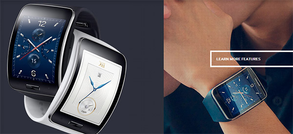
Smart watches have to combine the visual design of a wristwatch with the functionality of a smart device, which brings us to a mixed set of controls. Users are already used to a number of touchscreen gestures, which are somewhat hard to implement on a smaller screen. For example pinch to zoom. It is nearly impossible to use this gesture on a smart watch, unless it is the Samsung Gear S, which is enormously big or the Apple Watch with its “digital crown”.
Another big issue in terms of usability is the inconsistency of gestures on smartphones and smart watches. When the same gesture functions differently on two devices, it is rather difficult for the user to handle any of them. Surely this will mostly affect the smart watch experience, as smart phones have been around for already too long and users are quite familiar with the main set of gestures. For example, the long tap on an iPhone lets you delete or reorganize apps. But the same gesture on the Apple Watch brings up additional settings and controls. So from a user experience perspective this is a real issue.
Closing Thoughts
If smart watches are the next big thing like tablets, then surely they will develop rapidly and with every new generation these devices will become better and smarter. Hopefully with some hands on user testing and research data smart watches will also deliver a better and smoother user experience.