How to Use Vertical Rhythm to Your Advantage?
Typography is a big part of any design, especially web or app design. Vertical rhythm is the alignment of lines of text in terms of text size and the spacing between the lines. It is often used to organize text and make it more legible; in turn, this makes the reading experience much better and the design more appealing.
I’m here to show you how vertical rhythm can be set so that you can take advantage of it in your future designs and take control over your typography.

What Makes for Good Rhythm?
There are two things that effect vertical rhythm, font size and line height. (When dealing with code you should also include margins.) When it comes to creating a good rhythm, readability is the key. The better the rhythm, the easier it will be for people to skim and read your content. Additionally, when the ratio of your different texts on your page is drastically different, like having a big heading and tiny body text, it too contributes to a poor reading experience.
Vertical Rhythm in Photoshop

I’m not going to bother you with theories about what makes for good vertical rhythm. Instead I will just show you. I’m going to use part of a newsletter I’ve sent out for a book I’m writing as an example.

The image above is what the email content looks like with plain 14pt text, and the Photoshop auto line height. I’ve styled it a bit to fit the layout formatting I’d like the text to be; as you can see the paragraphs are divided and some text is centered.
I want to show you how the text is being manipulated when you have a 20px grid over it. Why 20px? Because compared to a 14pt font size it seems to be a good baseline grid. We will align the text to it later but for now, keep the line height set to auto so that you can clearly see how the text doesn’t align well.

Adding Headings
The next step is to define the two headings the design has. First is the “A discount for being awesome!” line which is H1. Because we are keeping the body text at 14pt we can’t have the H1 be too big. Use your best judgment to see what makes a good size for the H1. I’ve settled on 30pt.

Of course next thing is to increase in size of “Get $5 off the eBook” as that is our H2. I’ve made it 22pt. It’s not too big compared to the 30pt H1. As you’re changing the size of the fonts have you noticed how the spacing between them shifts? It doesn’t matter if you are working in Photoshop or CSS, if you don’t set a specific line height for your text, the vertical rhythm will not be cohesive for the design.
Setting in the Line Height
In Photoshop, now set the line height to 20px – you might have to manually move the text to match with the lines – but the text is now beautifully aligned. If you take a look at the text before and after the line height change you can see that having the same line height through the whole text makes all the difference.

Vertical Rhythm in CSS
I hope the example above showed you the importance of line height compared to varying font sizes. When it comes to CSS things aren’t as simple because there is also the question of margins and it doesn’t allow for simple line height settings like in Photoshop.
In order to help you figure out all of those things, for all of the various text types – from H1 to p, and everything in between – there are generators to help you figure out all of the measurements. You don’t have to fiddle with font sizes to see what actually looks good – they tell you what is good.
My favorite tool is the Vertical Rhythm Tool by Sqor. Let’s continue with the 14pt body font size as an example to figure out the CSS code. The base line is 1.5 the size of the font for arbitrary reasons, but it does actually look good.
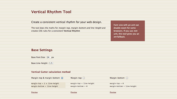
The next step is to choose how you’d like the margins to be set for your text. This is more of a preference as the margins will be creating the same spacing no matter if they are split, top only, or bottom only. I always choose margin-bottom because for me it’s important to have bottom margins in case there are some images mid text. I’d recommend against both, top and bottom margins, as that is simply messy code and is difficult to upkeep.
What Is Going on in the CSS?
I want to make sure you understand what is actually happening in the CSS you were just given because it will help you understand vertical rhythm a little more. Here are the first four rules that were generated based on a 14pt base font.
html {
   font-size: 62.5%;
}

body {
   font-size: 1.4em;
   line-height: 1.5;
}

p, ul, ol, dl, blockquote, pre, td, th, label, textarea {
   font-size: 1em; /* equiv 14px */
   line-height: 1.5em;
   margin: 0 0 1.5em 0;
}

h1, .h1-like {
   font-size:  1.8571em; /* equiv 26px */
   line-height: 1.6154em;
   margin: 0 0 .8077em 0;
}
If you take a look most of these are either in ems or percentages. That’s because font sizes need to be more fluid for usability purposes. This shouldn’t stop the typography from looking good.
Skipping over HTML, the body has a font size defined at 1.4em and line height at 1.5. This is the base font size and line height which we specified and this will set the other measurements within the vertical rhythm CSS we just generated. It’s in the following two rules that you can clearly see the magic happening.
Take a look at the third rule which defines the font size of all the major tags and elements which are paragraph, lists, and textareas among other things. It’s good to be thorough so that you don’t have to repeat yourself and potentially mess up your rhythm.
As you can see there are only three things defined in that rule. First there is the font size. It’s set to 1em which means that the font size will be 14pt. Wonderful, it’s exactly what we wanted. Second, there is the line height set to 1.5em, in pixels it will be equal to 21px, because 14px *1.5 is 21px. Thirdly, the bottom margin is also 1.5em, which is 21px in this instance making for a very simple vertical rhythm definition.
When you move into the H1 you can redo all of the calculations but what you will notice is that they all add up to preserve the overall base height of 1.5. Although the headings have a bigger font size the line heights are preserved in 1.5 – 3, 4.5 and so on – to keep the proportions the same and therefore keep the lines in rhythm.
Conclusion
I know vertical rhythm is quiet all over the place but it’s a concept worth understanding. I have shown you how to set vertical rhythm in Photoshop through line height and how to generate vertical rhythm for your CSS. If you try to calculate your own rhythm, all the power to you but for now you should have a foundation to realize why it is important and how to use it on your next project.