7 Usability Best Practices for eCommerce Product Pages
How much effect do product pages have on conversion rates? Well, it depends. But the fact is that this page is your final chance to make the user buy.
It’s here that users expect to find all the information they need to make a purchase decision. And it’s a big challenge for a UX designer, because there is so much information to be delivered in so little space. Probably that’s why most product details pages end up looking cluttered and messy. So it’s crucial to present that information in a way that is most convenient, easy-to-understand and convincing.
Here’s where usability techniques come in handy.
And who can tell you more about your website usability if not the users themselves?
Conducting user testing with your target audience can reveal the reasons for low conversions and even suggest solutions.
Oftentimes ecommerce websites have a beautiful design, excellent marketing pitches and very compelling offers, but somehow conversion rates remain low. This is one of the main symptoms of usability issues.
There is no ultimate remedy though. Every industry has its specifics and for instance the thing that works for an online jewelry store may not necessarily work for an online bookstore. But through benchmarking research and usability testing of ecommerce websites, we are able to identify some general best practices that can serve as a guide.
Impressive Visuals of the Product
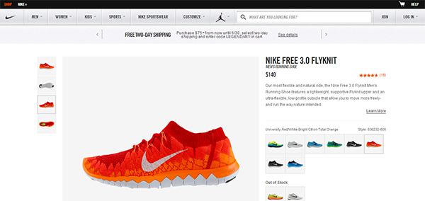
It’s no secret that these days the whole internet goes visual and every recent update from tech giants like Google, Facebook, Twitter are stressing the importance of photo and video content. The same should be applied to ecommerce websites, bringing the most impressive, high resolution photos, 360 degree view or videos of the product to the user. And this doesn’t mean having just one good photo and hoping to make users buy. It’s all about making it feel like real shopping and minimizing user’s anxiety about buying the wrong product.
So if you run an ecommerce website it definitely makes sense to invest in good photography and editing. But try not to go too far with Photoshop and keep the final shots as close to reality as possible.
Speedy loading
High quality images are good, but fast loading is paramount. Usability is all about saving user’s time and making the purchase process as fast and easy as possible. According to Kiss Metrics, 47% of consumers expect a web page to load in 2 seconds or less, while 40% of people abandon a website that takes more than 3 seconds to load.
But images are not the only problem that may be causing your ecommerce website to load slowly. It may as well be the large number of DNS lookups, too many HTTP requests, not using PHP accelerator or GZIP compression, etc. So make sure to minimize the waiting time for the user, because 1 second delay in page response may result in a 7% decrease in conversions, which is a luxury you can’t afford.
Detailed Product Descriptions
Imagine your product page to be the sales consultant in a real-life store. Only your visitor is all alone on your website and has to figure it all out by himself. So make sure the product pages have as much useful information as a sales consultant would. It is a bit challenging to organize all the details of the product, delivery and shipping information in a way that is easily readable but doesn’t overwhelm the user with too much text. So you may want to use some tabs and layering to break the content down into digestible chunks.
But the most important information, like product title, images, short description, pricing and availability, shipping and delivery methods, payment options should be always at hand.
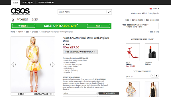
Dimensional Navigation
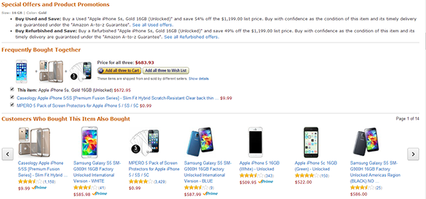
When you have a large assortment of products and so many filters that can hide them away from the user, you need to think of some interesting way to showcase your products while also helping the user find the best fit! There are some common ways to do so;
- Customers who viewed this item also viewed
- Recommended items
- People who bought this item also purchased
This kind of rich content makes it easier for the user to view, find and purchase the very product they came for.
Clear and Targeted CTAs
Needless to say that a well-crafted call-to-action is a real game changer in any website but especially in an ecommerce website. But what counts for a good CTA? Well, although there is no hard and fast formula, I dare say a working CTA should be:
- Brief, but action-orienting (Buy it now, Add to cart)
- Visually contrasting and easy to locate
- Comprehensible (use the same language as your customers)
CTAs are a great way to guide the user through the purchase process without interrupting their shopping experience. But the importance of a good CTA is even higher on a product detail page. So it would be better to run a couple of A/B tests with different wording, colors and shapes of the CTA to see which one works best for your particular website. According to the study done by Kiss Metrics, making call to action more prominent increases conversions 591%.
Trust Badges
One of the biggest challenges for an ecommerce website is to build trust and make the user feel confident about making a purchase. Running an ecommerce website directly involves payment on the user’s side, so for a smoother user experience you need to prove they can trust you. Don’t worry about cluttering your design with trust badges of various colors and shapes, it’s not the time to play aesthetics.
It’s when you need to give the user just a little reassuring nudge to go on and complete the purchase. According to the A/B testing done for Express Watches, replacing a “Never Beaten on Price” badge with a trust badge saying “Seiko Authorized Dealer Site” resulted in 107% increase in conversion rate.
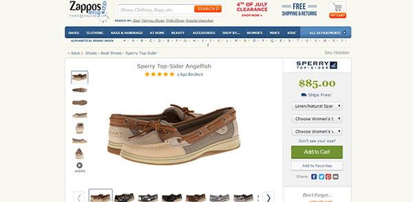
Stock Availability Information
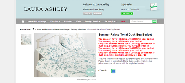
One of the most annoying ecommerce experiences for the user is to find out the item is out of stock only after clicking on it in the category page. Or even worse, find out there is no stock after hitting the “Add to cart” button. This is a surefire way to lose customers. The best way is to inform the user about the availability of the product right in the category page or not show it at all. Also, the stock meter in the product page should have instant validation to save the user’s time and patience.
Putting It All Together
Setting up an ecommerce website is tough, but even harder is to keep it running and growing. It requires constant analysis of website performance and most importantly optimization. Oftentimes webmasters are reluctant to making any significant changes to the website, while this may be the very thing holding it back. So my advice is to never stop improving and walk in pace with new technology. And finally, when in doubt, put yourself in your user’s shoes and everything will become clear.