Importance of Emotional Design in Web Design
Oftentimes we are trying to create a great user experience. Usually this means smoothing out frustrations where we are actually ensuring good usability and not necessarily a good user experience.
If you want to truly ensure your users will be happy to use your website or app you must delight your visitors; the best way to do this is through emotional design. Emotional design, in the simplest of terms, is a design that evokes actual emotions from a user, ideally positive ones like delight, joy or pleasure. It’s design for emotions within your visitors.
What’s the Big Deal?
Emotional design is becoming a more popular topic each day. Over the last few years there has been an increase in literature on this topic in both books and blogs. More notable contributions are books like Emotional Design by Donald Norman or Design for Emotions by Aarron Walter. Smashing Magazine has published some amazing articles on the topic as well such as the Personality Layer or Not Just Pretty: Building Emotion into Your Website. If you are further interested let me direct you towards my own blog Being Limited where I write about how emotional design is related to user experience and visual design specifically.
My point is this; the big deal about emotional design is that it matters. It’s a topic that is growing in traction because this style or method of design proves very effective in terms of creating a wonderful user experience. This, in turn, helps conversions and business over all.
Show Me Some Examples
I can talk about the glory of emotional design all day long but instead, let me show you some actual examples of how emotional design comes into play. The best way to illustrate this, is to show a comparison between an emotionless website and one that employs emotional design to its advantage, and the best example of these would have to be banking websites.
Dry Emotional Design
The most notorious or infamous example of a blank design would have to be banking. Take a look at most of the websites of major banks. Chase, Bank of America and Capital One have blank and stale websites when it comes to emotions.

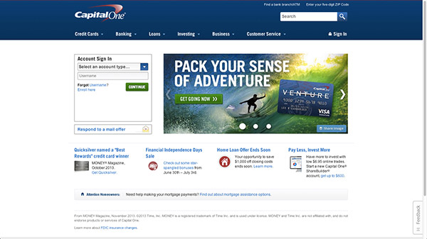
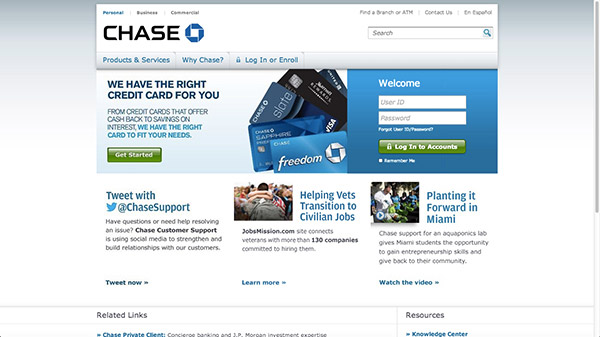
It should be important for a bank to have an emotional connection with their visitor as it serves to build trust. For a financial institution it’s crucial to have an emotional connection as those convince potential customers to becoming actual customers and sign up for a banking account. If Chance, Capital One or Bank of America utilized emotional design within their website I’m sure their public image and conversion would increase. A website can be both professional and appear trustworthy when it employs emotional design.
Delightful User Experience
Take a look at websites like Simple, AmericanWest Bank or Moven. They are all financial websites, two of which are actually banks. They utilize emotional design to their advantage. Let’s go over them one by one to see exactly what they do to evoke positive emotions within their visitors and why it works to their advantage.
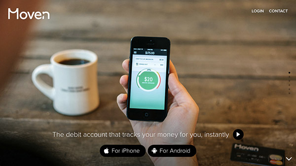
A Transparent Experience
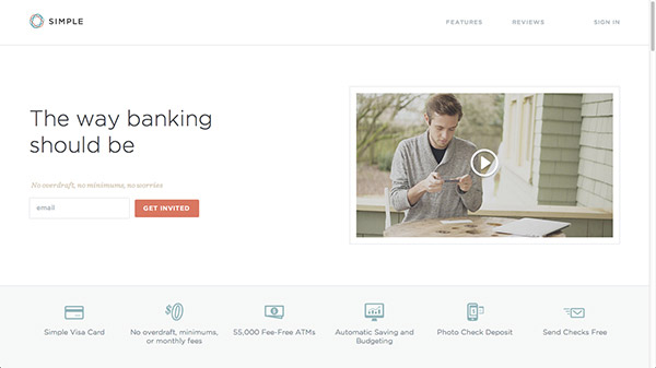
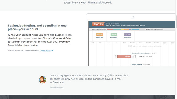
Simple is known for having a wonderful design from the get go. It won the hearts of designers and developers right away. Why? Because first of all, their website actually looks nice. Furthermore, their website implemented emotional design into its design to create a more intimate, positive feel which only helped to increase users’ trust and therefore conversions.

As you can see their website is very clean. It doesn’t have a lot of clutter at all. It makes for a pleasant atmosphere. Currently their website has a simple call to action that doesn’t bombard you with deals, promotions or whatever else that you just must have. Additionally, it show a normal, legitimate human in a video to further show you that they care about their users.
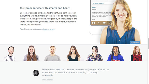
They invested time and money into having a normal looking model demonstrate the product not some weird looking stock photography that is smiling at you blankly. Off the bat, the website is pleasant to look at. It doesn’t have distractions, nor does it feel forced. That’s a wonderful experience, actually that’s very delightful and that is emotional design.
When you keep scrolling through the website you see good looking icons and readable fonts. It’s pleasant to look at! It’s a banking website, it looks good, and there is nothing wrong with that! Same goes for the other two examples!
A Delightful Scroll
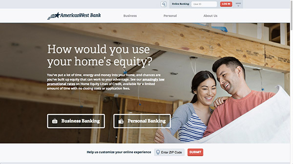
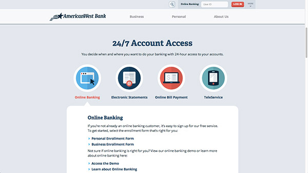
As banking websites go, this one sure has a trendy design. As a designer, it draws me in because unlike most other banks it actually looks good. First, I’m confronted with a big hero shot. It’s refreshing; most banking sites don’t look like this. To me this is interesting and different! Most banks have outdated websites at worst or impersonal ones at best. AmericanWest Bank utilize wonderful copy that embraces the visitor. It gets them thinking about themselves, not about some silly feature the bank offers. It engages the user right away.

As you scroll you see more benefits and features displayed. They too use great icons in the ever so trendy flat style. It beats a stale stock image any day. On top of that, they use vibrant and wonderful colors. Icons use rich shades of blue and red; this makes them stand out, this makes me look at them. Furthermore, the overall color scheme is friendly too. They use a lot of various shades of light gray – it’s pleasant. The fact they embrace the flat style makes the website come off much more friendly actually. All in all, their home page is very simple. It’s delightful to scroll down their home page because it’s a friendly and personal experience.
A Financial Story
When it comes to sharing financial information it’s important to gain peoples’ trust. Moven is an app that helps you track what you spend your money on. It needs access to your accounts to help you track your spending. In order to gain users trust it utilizes story telling into getting people not only to trust them but see the value in actually using the app in the first place.

The website is divided into six sections; each of which tell a different part of the overall story. The website has a magnificent flow as the first section introduces the app, the second provides a clear value proposition – instant feedback on your spending to keep your spending in check. The benefit is simple, it’s obvious. More so, the design is delightful; it’s light and because it is divided up it doesn’t require much thinking by the user. Instead, they just glide through the story that is Moven.
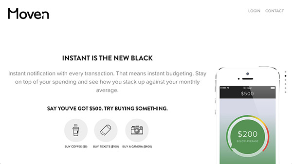
As you can see the app is not afraid to show off their human side. Their copy is phenomenal. “… no annoying fees” it’s so informal, it’s a brilliant move to ensure the user sees the people, the culture behind the company. Copy is how a user starts to make a connection, and that, my friend, is emotional design at its best.