The Basic Anatomy of a Brand Style Guide
Style guides were originally created for printed publications to establish a consistent usage of layout and language by a variety of contributors. Today, branding style guides have a similar purpose to establish consistency but of a company’s brand instead.
Now that publishing is available on countless different platforms it is important to keep the brand constant; this is especially true for bigger companies where there are many different people creating company collateral. In order to prevent mismatching and misuse, style guides were created. It is important that your style guide covers at least the basics, which are the company logo, typography and color guidelines. Of course you should not stop there, as those are just the bare minimum.
Why Are Style Guides Important?
Consistency is promoted very well throughout and because of a style guide. Having solid guidelines shows others what they should do, instead of them doing what they think is best which causes arguments to arise. At the same time, if everyone is on the same page there is a tremendous amount of time saved, which is the second benefit.

Time saving is crucial for any company; a style guide will do just that by guiding you to quick answers and resolutions about how to format your documentation for the brand. If it clearly shows you what to do, you don’t have to waste time creating your own idea of what it should be – it is laid out for you. Therefore, a style guide consolidates the process of document configuration.
Cost saving is the benefit that comes along when you save time as other people are not wasting hours trying to figure out what it is that their documents should look like. This is basically the idea that time is money where if time is saved, money is saved too. Additionally, a style guide replaces training, and lectures about how to go about a brand because it should be a simple, easy to follow and to understand document available to everyone.
Professionalism is what you get when a company keeps a consistent image; a company comes off weak if they have so many mismatched and disorderly logos floating around. It can seriously hinder a company’s image and reputation if it sends out documents or creates web pages where it is obvious it was made by a bunch of individuals trying to accommodate a brand rather than a professional company.
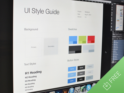
Logo
First and foremost, it is crucial for your style guide to include a logo. I mean, if you don’t it defeats the purpose of a style guide. It is, in my opinion, and relatively speaking, the most crucial section of the style guide. But, don’t worry style guides aren’t that complex so it is not going to be that bad.
There are a few things about the logo that you need to show in order for others to successfully use in documents. Let’s start with the simplest of things which is the spacing around the logo. The guide should show how close other elements can be placed next to the logo – like other logos if its in a logo pond, or text if it’s in a PDF. It is basically the minimum allowed margin around the logo simply so that it is not squished, or worse, being overlapped.
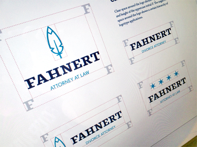
The next thing that you could show is allowed and forbidden variations of the logo. Take a look at the Fahnert logo example above. In addition to the margin spacing, you can see there are actually four variations where the leaf symbol is either on top or to the left of the name, there are stars above the name or there is just the name – Fahnert – with no symbols. Demonstrate the few variations your brand allows so that others know it is only allowed to be shown in those ways.
Lastly, what you want to do is show the logo against different colored backgrounds or in different hues. For instance, for some companies it is okay to show the logo in gray scale but only a specific shade of gray; in others, if the logo is made up of a few colours, it is not allowed to be in any of the colors individually but only the multicolored version.

If you want to show off to others how the logo came about you may embellish your style guide by throwing in ‘How it came to be’ type of graphic, like the Rocket Anatomy shot you see above.
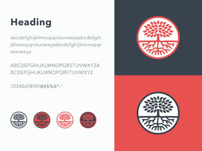
Typography
Unlike the logo, typography is very straight forward. There are a few obvious things you need to state: which typefaces are allowed for use by the brand. Then, for each typeface you should show how the lettering looks in various formats including h1-h6 and plain paragraph text. It would be tremendously helpful if you defined bold, emphasized and highlighted styles as well. Lastly, if you feel like taking your typography section to the next level don’t forget to include the different link states such as defiant link, hover, active and visited. And, of course also show off the different colours that the typography could be.
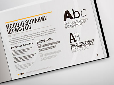
A word of caution: if the typeface of the logo is not used for text within your website do not include it in the typography section. You may identify it but if you don’t want it used as anything but the typeface of the logo; people may think it is okay to use it when it’s really not.
Colors
Even though colors are important to both the logo and typography section, it does deserve its own section. Every brand will have its own specific colours – you need to identify them. Show off what they look like so others can clearly identify them. In addition to this, you should provide the various hue values. If the color has a name – usually given by the company, but not always – include that too. But also always include the hex and rgb values; always! It wouldn’t hurt to also add the cmyk values as well. And, if you are feeling fancy throw in Pantone; but that is surely unnecessary.
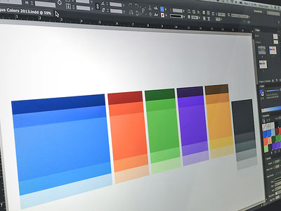
What makes for good brand colors are also color variations. Take a look at the above Disqus Palette. Not only does it have the main brand hues – oh, it has them big so you know exactly what they are – they also include allowed shades and tones of the colors. This comes in handy as some people may try to use a darker to lighter hue that they find to be fine. And you can’t blame them because you didn’t give it to them. By simply providing the allowed various shades you will eliminate a lot of mismatched documents.
Going a Step Further
Now that we’ve got our basic bases covered lets go over some of the additional items you may want to cover. I’ve made you a list:
- Buttons (Active, Inactive, Hover, On click, Size variations)
- Checkboxes, radio buttons, dropdowns and form fields
- Icons
- Social media

Of course if you find anything else to be crucial for either the website or company documentation, include it. Better have it there and guide one person who ever needs it than not be there and cause mismatched and misused documents.