Design Tips for Building an Exquisite Portfolio
Any successful web design agency, studio, or independent freelancer has started from the beginning at step #1. It’s not an easy road to build up your own skills and develop websites from scratch. But in doing so you can learn powerful lessons about development & project management, not to mention working in a team setting while juggling other various tasks.
To get anywhere in such a booming industry you’ll need to have some credentials behind your name. I want to share a few ideas for building a stunning portfolio website where you can showcase talented works. These could be web projects or other digital graphics. But really your website should be designed around your own personal traits and characteristics. There is plenty you can learn by studying the techniques of other top-notch designers.
Effortless Navigation
One key point to start with is your website’s navigation. Visitors to your site will be looking for particular information on yourself or your design agency. It’s crucial that these pages are easily accessible without looking around too much.
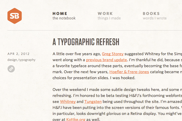
Some of the best portfolios I’ve seen have also been the smallest in regards to content. If you can separate the website into many smaller pages this hierarchy becomes a system of organization. Visitors can easily go through a portfolio sorted by category or publication date. It’s much more difficult if all your project entries are listed together on one page with full screenshots and details – too much confusion.
Another notable idea is to keep your website navigation local at all times. There are some jQuery plugins and even CSS3 effects which will keep your navigation in a fixed position. As visitors scroll down the page you can offer an easy transition between different sections.
The trend of fixing a top toolbar in place is also fairly prominent. Visitors can scroll down and read through your content without having a sidebar or floating menu blocking anything. But if this idea of static navigation sounds annoying, consider placing a larger link collection in your website footer. This is often an empty area where you can setup 3 or 4 columns of related links.
Brand Recognition
When getting started as a designer you don’t often look into marketing. But without the buzz behind your name it’s tough to land any solid work. Branding is a huge part of your portfolio and must stand out from the competition.
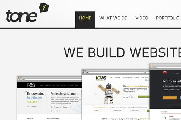
Tone has done an excellent job with a very minimalist branding. Their logo and lightning symbol represent the company and their projects. This icon is also seen throughout smaller sub-headings and in the website favicon. Something simple yet recognizable at 16×16 pixels is a brand to strive towards.
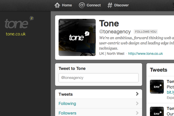
I should also mention branding yourself through social media. Facebook and Twitter are a no-brainer since the whole world is connecting through these networks. You can see an example of even more branding on the Tone Agency Twitter page. But you should also consider joining some professional networks such as LinkedIn or Google+. All of this marketing & branding work cumulates as more people are searching for your design services.
Showcase Relative Works
There are plenty of times where freelancers or design studios will pick up work solely for the money. Perhaps the client is not within your usual customer base. Or maybe their requirements just aren’t going to set the stage for an enormously successful project.
Either way you should be a little picky with your portfolio entries. Sometimes you will want to remove older websites because they conflict with your current style. Designs from 2006 are not necessarily relevant in modern times. Since I can also understand why many studios would keep a chronological gallery of all their clients, this comes down to personal preference.
From my own experience a nice middle ground is to setup a page on your website with featured listings. This would display a set of 4-8 hand-picked portfolio entries to quickly grab people’s attention. Then also include a smaller link leading to the full portfolio with all your entries and past projects. It’s a nice system because most visitors are only seeing your highest quality works while those who want to dig a bit deeper can see everything.
Open Communication
One of the most off-putting facets of a bad portfolio is any lack of contact information. When you have people interested in your services they want to shoot out a quick e-mail message and move along with their day. Really try to streamline this process so your visitors don’t need to scroll through pages to find your contact form.
The traditional Contact page always works best if you can fit enough information. Depending on your preference it’s also nice to offer additional connections aside from e-mail. Skype, GTalk, and MSN are fairly popular instant messaging clients which are even better for direct communications. If you’re working in an office space with some other employees you may also setup a small landline phone instead of putting out cell numbers.
Diversify!
I think the portfolios which really stand out to me are the websites with no alternative comparison. Designers are always looking for new inspiration and your own website is a glossary of all your previous ideas. Don’t be afraid to really go crazy with illustrations, icons, vectors, whatever you can do best to showcase your talents.
Diversity is the key to gaining recognition amongst a sea of other portfolios. A typical design agency/studio website is not similar to a blog or web forum. You should be going way outside the box if possible and capturing visitors based on the “wow” factor.
When first getting started and building your skills this may not be an option. To initially just get a website online you may consider a more minimalist approach with extra whitespace and padded edges. But over time as you develop a richer portfolio it’s worthwhile going back to the drawing board and seeing if you can redesign the website with more flair. Eye-catching graphics will be memorable and always leave a strong lasting impression.
Final Thoughts
There is certainly no single factor used to design the perfect portfolio website. If you’re getting into the business of web design then your skills will always be improving. This means your design styles will change over time and mature, along with your portfolio.
But regardless of style you can always focus on these similar techniques for branding. Design agencies and studios have an advantage since they’re working in a team setting. But anybody can garner success on the web with enough time and dedication. If you have similar ideas or examples of portfolios feel free to share with us in the post discussion area below.


