Understanding Color Theory and the Color Wheel
Sometimes the toughest step in building a new website or redesign can be the conceptual ones. Selecting a color palette is one of them that can be tough if you don’t have the right tools. So where do you start?
It all comes down to basic color theory and the color wheel. That same tool that teachers used in school really is the basis for how designers plan and use color in almost every project from the simplest web page to expansive brands with multiple sites and campaigns.
Basic Color Theory

Scientifically speaking, color is the visual presence of light in different wavelengths and relates to how these wavelengths are absorbed or reflected. Total absorption of wavelengths results in no color (black) while complete reflection results in white. Anything in between creates a color.
The most common way we, as designers identify color is by name. But we also use other methods as well as they relate to how color is being used – think about color names as CMYK, RGB or HEX values. Most commonly color is categorized using the color wheel, the most common platform for color theory.
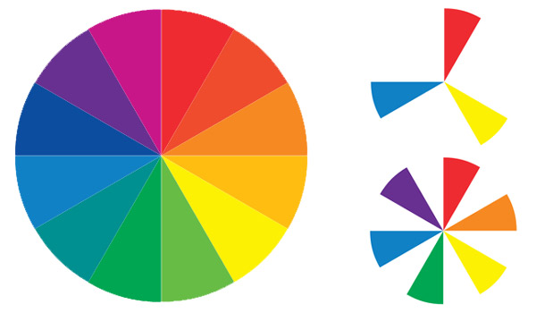
The color wheel is a circle dating to the days of Sir Isaac Newton in the late 1600s. It is used by scientists, artists and designers to help understand and explain color and color pairings. The basic wheel contains 12 colors – three primary colors, three secondary colors and six tertiary colors — in a logically arrange format. The wheel is used from everything from choosing what color to paint a house to art to web design.
The expanded color wheel, which is the basis for most RGB color pickers in design software, is an extension of the basic wheel. Colors are grouped in the same way, the difference is the inclusion of white, and subsequently tints, on the wheel.
Primary Colors


Red, yellow and blue are primary colors.
Primary colors are the basis for the entire color spectrum. All other colors are created by mixing combinations of these hues. Conversely, no combinations of color can be used to create a primary color. They, in essence, exist as a base for every other color.
Secondary Colors


Green, orange and violet (purple) are secondary colors.
Secondary colors are formed when two primary colors are mixed in even amounts. Each secondary color falls between the primary colors used to create it on the color wheel.
Tertiary Colors
Yellow-orange, red-orange, red-violet, blue-violet, blue-green and yellow-green are tertiary colors.
Tertiary colors are formed by combining primary and secondary colors equally. The names of tertiary colors are derived from a combination of the colors used to create them. The primary color name is first, followed by the secondary color. The color is located clockwise from the primary color it contains.
Different Types of Color Schemes
There are several basic types of color matching based on the color wheel. Sticking to one of these three themes will almost guarantee a successful color palette.

Complementary colors are those that are opposites on the color wheel. This applies to primary, secondary, tertiary colors and variants of each. Complementary color schemes use opposing colors to create a great deal of contrast and impact. These color combinations also create feelings of stability. Some designers like to add a third color for accent purposes by implementing and split-complementary scheme, using one base color and two adjacent colors as accents. Split-complementary schemes are rather simple to create and have a more harmonious feel than a straight complementary color scheme.

Analogous colors are located side-by-side on the color wheel. Analogous schemes can use two, three or even four adjoining hues to create a palette of balanced color. Analogous color schemes are popular because the color combinations often mirror colors seen together in nature. Think about the colors of a common houseplant for example, with green stems and lighter green (yellow-green) and yellow leaves. When using this type of color palette, designers frequently opt to make one color more dominant in the design than the others.

Triad color outlines use three colors that are evenly spaced on the color wheel. This is one of the least common methods for creating a color palette because colors can sometimes be difficult to balance with so many bright hues. To ensure success, pick one color as a dominant hue and use two accent colors.
Color Associations


Color is a great tool when it comes to emotion and feeling. Create a color palette connects to the feeling you want your site to convey.
Think about how active or warm or passive or cool your color associations are in the design process. How do those associations relate to the message of your site?
Warm, saturated and lighter colors are thought to be more active and advance visually. These colors, which fall between yellow and violet on the color wheel, are the warmest emotionally and have the most active associations. Red, for example, is often used for restaurant websites because the active color is linked to having a good appetite.
Cool, less saturated colors tend to pull back when you look at them. These colors, from yellow-green to red-violet on the wheel, are considered passive and cool. They are also time-tested as some of the most trusted color choices. That’s why many financial institutions, for example, use blue as a base color.
Color Terms Glossary
Hue: The actual color of an object based on color name. Often the terms hue and color are used interchangeably.
Intensity: Colors can be bright or dull, changes that are created by adding white or black to a certain color. The addition of either lessens a color’s intensity. The highest intensity colors are in their truest forms.
Primary color: Three base colors that can’t be created by mixing other colors. They are red, yellow and blue.
Saturation: Relates to the purity of color (with the addition of other colors). The most saturated colors do not have white or black added to them. The least saturated colors do.
Secondary color: Three colors that are created by using equal parts of two primary colors. They are green, orange and violet.
Shade: The result of adding black to a color to make it darker.
Tertiary color: Six colors that are created by mixing a primary and secondary color. They are yellow-orange, red-orange, red-violet, blue-violet, blue-green and yellow-green.
Tint: The result of adding white to a color to make it lighter.
Tone: The result of adding gray to a color. Tones are a mix of tints and shades and can take on properties of each.