10 User Experience Principles for Mobile Apps and Websites
Mobile is the next big thing. Although it has already emerged drastically, there’s so much more potential to be unlocked and the ones who realize that early enough will benefit from it the most. But going mobile is not just shrinking you existing website to the small screen size and waiting for magic to happen. No.
Not long ago having a minimal working mobile website was tolerable, now things have changed and requirements are much higher. Users are expecting to have the same level of comfort and experience when browsing on mobile devices as on the web. Those who fail to deliver consistent quality UX across multiple platforms are not only missing new business opportunities, but may also lose a portion of their current business. So the sooner you optimize your mobile presence, the better.
Mobile user experience is a combination of feelings, thoughts and emotions that are present when users interact with your mobile website or app. It’s all about making the mobile environment comfortable, intuitive and delightful for the end user. Sounds pretty much like web UX and there is indeed a lot in common, but some principles of web usability may not work for mobile devices and some unique mobile features may require a different approach to designing amazing user experience. So let’s go through some of the mobile-specific UX principles that will improve your mobile app or website performance.
1 – Understand user’s motive
Before designing a mobile app or website, it’s essential to understand user behavior and the goals behind each action. If you already have a working website or web service, then you probably have plenty of analytics data to work with. Analyze user flows on mobile devices to see what users are looking for, what features they use and how they interact with the website. It will give you clues on what type of content is more important for a mobile user. But if you are starting from scratch and have no user data, whether you like it or not, user research is the only way to go.
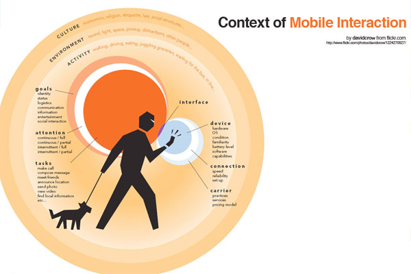
2 – Define the context of mobile usage
Mobile context is the situation, the circumstances in which users are going to use your mobile app or website. Unlike web experience, which usually occurs when users are at their desk at work or at home, mobile experience may occur absolutely anywhere and anytime. That’s why it’s important to understand in what conditions people may use your mobile product. If for example it’s a GPS navigation app, then it will probably be used while driving a car, so maybe you should consider having a voice navigation feature for a better UX.
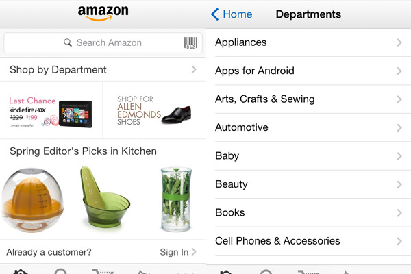
3 – Showcase the most important features and content
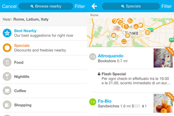
When you have only 3-4 inch screen to display whatever there is on a 27 inch screen, you have to set priorities and decide which content is important enough to make it to the mobile version. It’s a general practice to reduce the number of features and amount of content for a mobile device, because data analysis confirms that when browsing on mobile devices users behave differently. There are a few predominant pages or features that are frequently used on mobile and obviously you need to put those content types first. The rest may still be accessible in dropdown menus or “see more” options, but the idea is to fill the valuable real estate of a mobile screen with what is more important for the end user.
4 – Design more usable navigation
Since a mobile screen is much smaller than a web screen, there is a need for a simpler, more user-friendly but still meaningful navigation system. The general trend is having a vertical navigation instead of a horizontal one that is frequently used on the web. But depending on what user’s motive of using the service is, you may decide to make a heavier emphasis on images and visual content, while hiding the navigation away into so-called “hamburger” menu or maybe combining both horizontal and vertical navigation, whichever works best for your web service. Anyway, you need to have clear and concise menu labels to help users understand where in the website they are and where they may go next.
5 – Keep the design simple
When you have a look at the featured apps on Apple app store, you will notice a general trend of cleaner, simpler UIs focused on functionality and content rather than complicated design elements. This is the case when less is certainly more.
6 – Make good use of mobile specific features
Remember the time when mobile phones were used only for making calls? That was so long ago, but the call feature is still there and is probably the strongest advantage of smartphones over desktops. As simple as a “click-to-call” button can essentially increase your website/app conversion rate. Another mobile specific feature is location information that can be collected to provide customized UX, local recommendations, etc. And of course well-thought push notifications can help your app fight for the user’s attention and commitment, which is nearly impossible on the web.
7 – Optimize forms and reduce data input
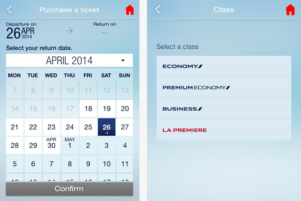
Nobody likes filling in forms, especially when you have to do that on a microscopic keyboard and on the go. As already mentioned, people use mobile devices in many different situations, most of which include moving and it’s terribly uncomfortable to fill in that tiny fields multiple times (because you can’t make it without a typo). So it’s your task as a UX specialist to reduce the frustration and negative emotions of users filling in mobile forms. You can do it in a number of ways: ask users to select predefined answers (if applicable); use other input mechanisms like voice input; whenever possible offer default answers; offer auto-completion and spellcheck technology to reduce typos, etc.
8 – Provide access to full website
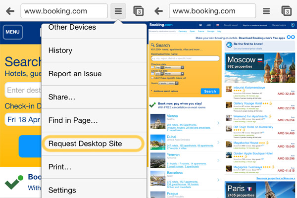
No matter how brilliant mobile UX you deliver, users should a have choice of which version of your website they prefer at any particular moment. Google Chrome does a great job with its “Request desktop website” feature. When designing a mobile website, you prioritize the content that will appear on mobile version. Eventually some features are dismissed or lost deep in the navigation and users are unable to find them. Why not help them out and provide a quick link to the desktop version?
9 – Design user-friendly notifications and alerts
Mobile apps have an exclusive opportunity to get user’s permission for annoying them with push notifications. Few users will take the time to turn off those alerts and may decide to remove the app altogether. This is a pessimistic scenario but if you want to deliver enjoyable UX, designing usable notifications is paramount. You need to make them timely and relevant, with a clear and comprehensible message so that users don’t get frustrated and more importantly let users choose which notification they would like to receive. This makes for a relatively positive notifications UX.
10 – Collect feedback and adjust
Since technology is evolving rapidly, things that used to work yesterday may be completely useless tomorrow, so you need to constantly have your finger on the pulse and adjust your app or website to latest tech changes. Provide an easy way for users to leave feedback, report issues and communicate with you directly, because nothing can be more valuable than customer opinion and advice.