5 Things You Need to Know About Typography
My name is Carrie … and I am a type nerd.
It’s totally true. I’ve not used certain words in specific typefaces because I did not like the way the letters looked together.
I have a distinct affinity for certain characters as well. I have a board on Pinterest devoted to the ampersand and I especially love Cs and Js. (I can’t tell you why.)
But typography is about more than just liking how letters look together. It is about understanding letterforms and how to merge them seamlessly.
Here are five things you need to know and understand on your way to becoming a type nerd.
Type Categories
Typography can fall into several different categories that are based on the look and style of lettering. Knowing these categories can help you identify the mood, time period and other attributes associated with a specific typeface.
Commonly, type is grouped into one of six categories: Old English (or Old Style), Serif, Slab Serif, Sans Serif, Scripts and Decorative (or Novelty).

Old English typefaces are easy to identify. These thick, elaborate typefaces are often used as the nameplates for newspapers such as the Chicago Tribune or The Washington Post. Each character is identified by the multiple strokes used to create it. These typefaces tend to be weighty and best for use in limited applications, such as logos or nameplates.

Serif typefaces are some of the most common used in printing. Many books, newspapers and magazines rely on serif typefaces for main body copy. The category is identified by an extra stroke on the end of each letter; it may be simple or decorative. Serifs are drawn more simply than fonts in the Old English style and are popular in a variety of applications. Microsoft Word, for example, defaults to serif typeface Times New Roman.
Slab, or square, serifs bring new and bolder meaning to serifs. These bold typefaces include thick uniform strokes and square-edged serifs. Slab serifs are great when you want to make a statement, but can be harder to read in applications that use a lot of text.
Sans serif typefaces are among the most popular in web design. Many argue that they are the most readable when it comes to screen contrast because of their uniformity. Sans serifs are without the extra detail at the ends of strokes and work great in both large blocks of copy and for specialty use.
Scripts are one of the more “fun” type categories because they are designed to mimic handwriting. This style is easy to identify but is best reserved for use with small blocks of type.
Novelty typefaces include almost everything else – from odd designs to custom lettering to – and are identified by a lack of other characteristics. Novelty typefaces can have no or multiple attributes related to other type categories. Novelty fonts are best used for logo or limited design applications.
Ascenders vs. Descenders
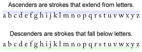
Ascenders and descenders are the tops and bottoms of letters that fall beyond the mid-range of each typeface, as defined by the x-height (measured from top to bottom of a lowercase x in any font).
Ascenders are the pieces above each letter. (Think about the tall stokes on the letters d, h and t.)
Descenders are the bits that fall below each letter. (Think about the tails on the letters g, q and y.)
Ascenders and descenders may be simple or decorative, long or short and may or may not contain serifs.
But in most applications, ascenders and descenders should not touch from line to line; this can make type especially difficult to read. Start with a line height or leading that is equal to or greater than the point size used to avoid touching ascenders and descenders.
Kerning and Leading
Kerning and leading are two of the most important aspects of lettering. They can make or break your typography, plain and simple.
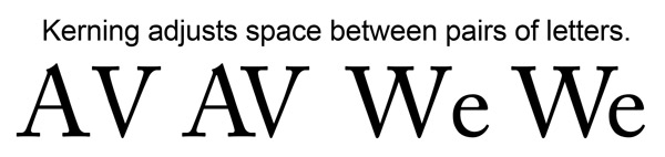
Kerning is the adjustment of spacing between pairs of letters. When type is kerned properly, each letter pair is filled with spacing that is like the next letter pair. Kerning refers only to the adjustment of pairs of letters; tracking refers to the adjustment of spacing for paragraphs. Why kern? Because not all letters fit well side-by-side. Look at the AV and We pairs above. Can you see the difference?
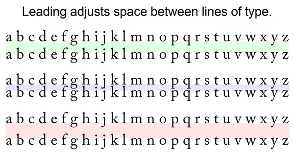
Leading is the distance from baseline to baseline in lines of type. In web design especially, this is often called line spacing. The amount of spaced needed between lines of type can vary greatly depending on typeface, size and application. I start with leading that is 120 percent greater than the point size for type and start eyeballing it from there. (For example 10 point type with 12 point leading.) And in the end, especially for web projects, I increase the leading. Especially small, or narrowly set, type can benefit from additional leading to make it more readable, while often larger type can work with tighter leading.
Great amounts of contrast – color, type size and medium – can play a large role in determining letter and line spacing attributes. Sometimes the best test is to just look at it. Is everything easily readable?
Type Measures
How many letters should each line include? Columns or not?
These can be two of the most important questions to ask as you set type. The width of a column and point size used in any particular typeface can greatly impact readability. Long lines can be intimidating and tiring on a reader’s eyes; short lines can cause odd breaks that can break concentration and hurt comprehension.
So where do you start?
There are a lot of “magic formulas” out there.
Typically, you want to keep any column of text to about 50 to 75 characters for line when working on browser-based, desktop websites. When working on mobile designs, drop the number to about 35 to 50 characters per line. (And characters do include spaces!) This concept works for type at pretty much any size; so once you determine a column width, you get an idea of how to size type for optimum reading.
Antonio Carusone also came up with a nice formula that has been floating around for a few years. He recommends multiplying the type size by 30 to get an optimum line length. So, 10 point type would work best in a type measure of about 300 pixels.
Alignment
Left, center, Right, justified?
How can you ever decide where to align type once you have it all ready to go?
It really depends on how much type you have for a user to digest.
First, consider the language. If people read from left to right or right to left. A simple rule is to align type accordingly. Left-aligned text is the most common type alignment in the world and considered one of the most readable alignment styles for type of any size.
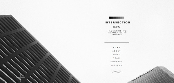
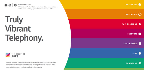
Centered type is also popular but if can be much more difficult to read in large blocks because lines of type are jagged on each side of the text block. This works best for items such as navigational tools or elements without much type.
Right-aligned type is most commonly used for block quotes, navigational tools or on sites that read right to left. This style can otherwise be jarring.
Justified text completely fills every line from left to right. It is a popular option in print publishing but much less common online. Successfully justified text often uses many hyphens and breaks to create adequate spacing, tools less often used online. In web applications, it is best used sparingly and intentionally.
Many websites employ type styles that allow for multiple alignments, such as centered items for navigation and left-alignment for body text. Logos and other specialty type may also use and work well with a variety of alignment options.