The Beauty of Minimal Portfolio Design
It wasn’t that many years ago when creating a design was a matter of cramming as much as possible onto each page, particularly the landing page – with the view that site owners want their visitors to get an eyeful of what they have to offer right off the bat.
That idea has, over the years, been reconsidered to the point where minimal seems to be the trendy way to go now. Designing in the minimal style is not easy – just like creating minimalism in interior design, you have to look at everything you want in the room/on your home page, then de-clutter – then de-clutter again, and again, and again. They say it can take many, many attempts at de-cluttering before you can truly call your home ‘minimal’ – fortunately, this is not quite true of minimal website design, but leaving out things that would have been unthinkable previously is an absolute must – or at least hiding them behind menu buttons or links. Here we have collected a selection of portfolio designs that are extremely minimal in their design.
Minimal Portfolio Design
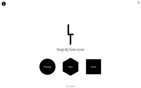
Tomer Learner
This designer, front-end developer and animator has an extremely minimal portfolio. Everything on this page except the text and share button is animated on mouse over.
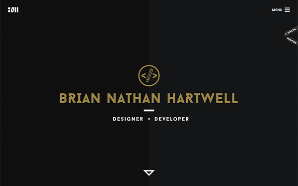
Brian Nathan Hartwell
This designer and developer uses the black, white and gold color scheme throughout his portfolio site.
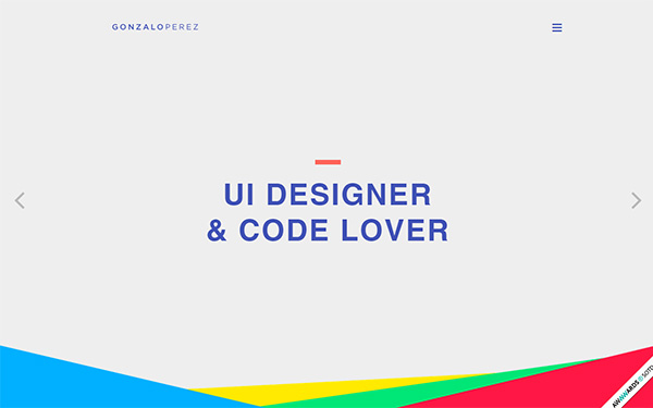
Gonzalo Perez
This UI Designer presents his site on a pale gray background, and as you scroll through the full page slide show all images have a purple overlay.
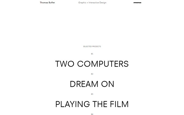
Thomas Buffet
This graphic designer’s portfolio is almost like a typed sheet with a list of selected projects – very minimal indeed!
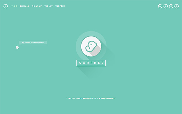
Garphee
This is the portfolio of graphic designer Razvan Garofeanu. This designer always keeps his portfolio well up-to-date and is always following the latest trends – this sees his site featured in many showcases. On this version of his portfolio he uses long shadows, hollow buttons and, of course, minimal design. He uses a little cartoon character to guide you around the site.
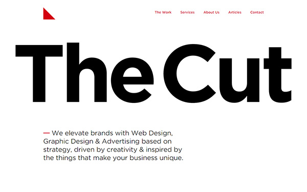
The Cut
This Australian web agency uses a very minimal design for its portfolio site. With huge headline text and a mainly black and red color scheme, it is presented somewhat like a newspaper. Even their red triangular logo is minimal.
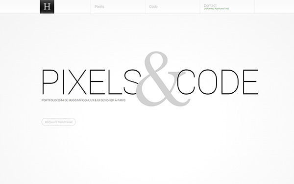
Hugo Mingoia
This French designer puts a lot of emphasis on the ampersand in his minimal portfolio design. Using the tagline ‘Pixels & Code’, the site has 3 categories along the top navigation bar: Pixels, Code and Contact. Clicking on the Pixels category you will find examples of the designer’s interface work, and clicking on the Code category will take you to his mobile website development work.
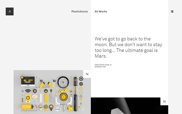
Plasticbionic
This portfolio belongs to a French designer who specializes in art direction. This is a very nicely designed site where mouse clicks take you everywhere, and you can go down, left or right. On the landing page he uses a quote from as long ago as 1930 by the astronaut Edwin Aldrin: ‘We’ve got to go back to the moon. But we don’t want to stay too long… The ultimate goal is Mars.’
Daniel Spatzek
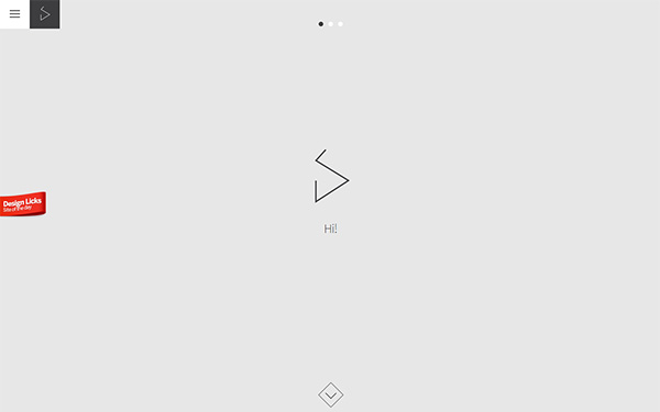
A gray background, 2 instances of the designer’s logo, a menu button, slide show progress dots and a downwards arrow are the only elements on this landing page.
Nat-Ant
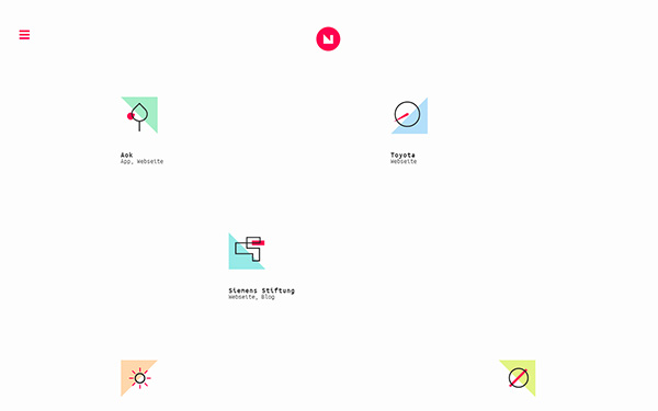
This German digital art director, whose name is Natassa Antonopoulou, uses small line icons on her landing page that will take you to some of her projects. As you scroll down the page there are more such icons. There is her logo and a menu button, and apart from social network buttons at the bottom of the site, that’s it.
Guillaume Juvenet
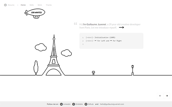
This young French creative designer uses hand-drawn line illustrations on his home page with an animated blimp floating across the screen with ‘Job Wanted’ across the side of it.
Su-Jie Wang
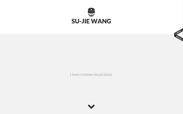
This designer, again uses light gray on his landing page. A slide show of taglines includes: ‘I love creative visual ideas’ – ‘I’m also into front-end development’ – ‘I love design concepts that deliver compelling stories’ – ‘And I also love burritos.’
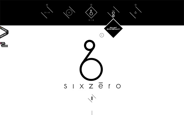
SixZero
This is a very, very unusual design. The icons at the top bring down a diamond shape on mouse over that display something about the designer: his name, what he does, his age, his passions. As you scroll down the page there are a series of white diamond shapes on a black background – each of these shapes has a color hex code, and on mouse over they become that color with the name of a project/client.
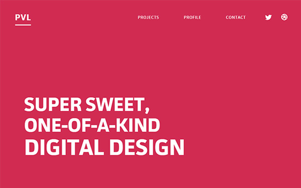
PVL
This designer (Isaac Paavola) uses a hot pink background for his landing page and huge headline text – a fairly brave design although minimal.
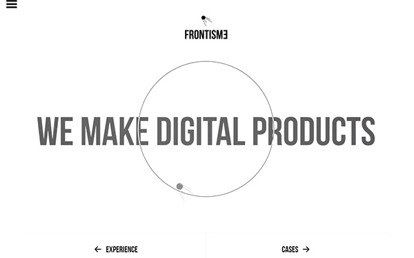
Frontisme
This Dutch agency uses a mainly monochrome color scheme. The ball travels around the large circle, and occasionally the text and circle flash – black, red and blue – there may be other colors, but my eyes aren’t quick enough to spot them!
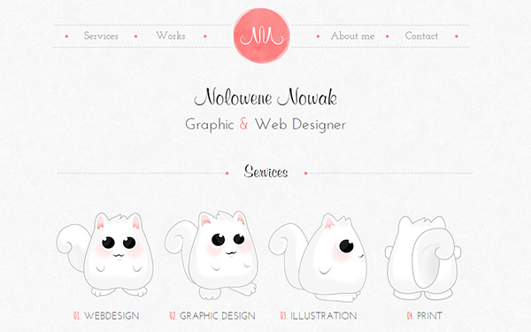
Nolowene Nowak
This designer uses some cute fat cat illustrations on the wash-out color scheme that makes up the whole design. Very muted and very minimal, but easy on the eye.
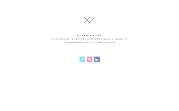
Aleks Faure
This is minimalism in the extreme… here you see the entire site – a double X logo, the designer’s name, what he does, where he lives, his contact address and social media links… that’s it!
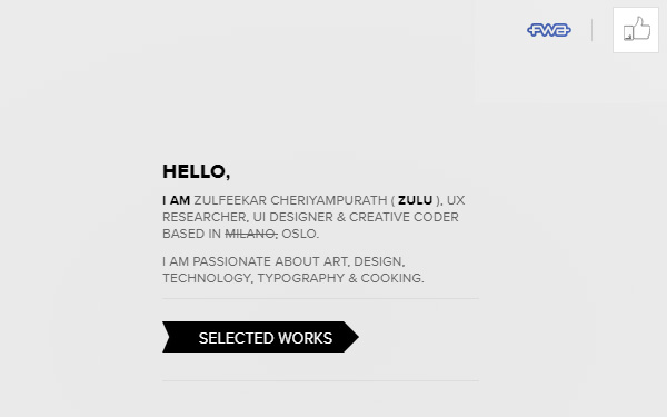
Zulfeekar Cheriyampurath
This designer and developer, in a similar way to the above example, has very little on his landing page, just a little information about himself – however, if you click on the Selected Works link you will enter a world of brilliant animations – still presented in a minimal style.
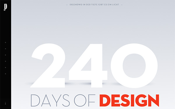
Julien Perriere
This is a somewhat different style of portfolio – it has a start and end date… if you scroll down from the landing page it says: ‘2013 – 2014 portfolio of Julien Perriere, a 22-year-old French designer. Everything you’ll see here was done in 240 days. Period.’
Conclusion
Some of the featured sites are extremely minimal, which I am not wholly sure works in the designer’s favor – with nothing to show on your site, only the minimalism of the site itself, are you really going to attract new clients?
