Mobile App User Interfaces for Simpler Navigation
The mobile iOS App Store has seen a tremendous influx in publishers over the past year. 2012 has been a phenomenal time for app developers with new creative and unique interfaces. From this small burst of creativity we can find dozens of examples for cleaner, more intuitive user navigation menus.
As such I’d like to dedicate this article looking into some newer trends for simpler mobile app navigation. iOS designers & developers are working together blending ideas with practical functionality and programming. There are also plenty of examples for mobile apps exclusive to the Android platform. But I feel that Apple developers are always ahead of the curve, which leads to a more polished and refined user experience within the App Store.
Sliding Panes
If you’re familiar with basic navigation systems then you must know of typical website photo galleries. These often include small dots at the bottom which you can click to pan through the different images. I’ve seen this navigation style in a few apps, but most recently in Pictwo.
This photo studio app allows you to import two pictures which you can then blend and mix together into a single image. Each of the editing stages is placed on a different navigation window. You can swipe in either direction or tap on the individual dot icons to move forward multiple stages.
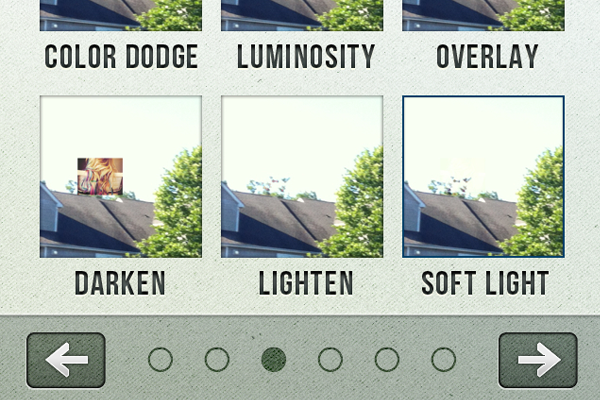
What I especially love about this navigation setup is the familiarity with other interfaces. Most smartphone users are accustomed to the dot-oriented navigation panel and so this doesn’t feel awkward or confusing.
But it is worth noting that this won’t always be the best choice for a mobile system. Sometimes you’ll need to explain where the navigation links will lead to, or how to get back a page. Only specific content which is grouped together can truly benefit from this gallery-style sliding panel approach.
Icon-Based List View
The list views for iOS apps are some of the more common interface layouts. These are long vertical navigation lists full of links to sub-folders and alternate views. We can see one good example on the Instapaper app home screen.
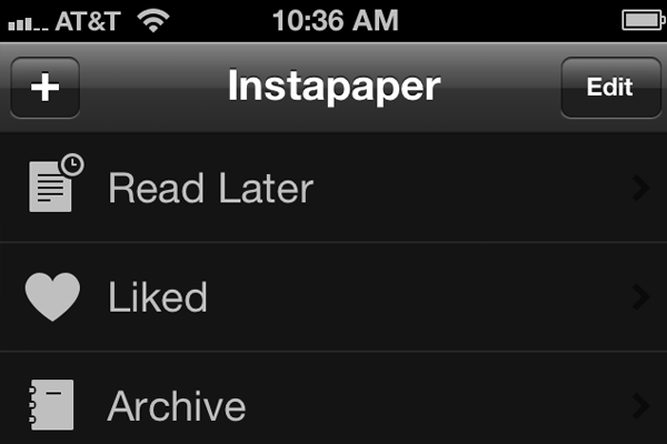
What I especially like about this design is their use of retina icons for some charming decorations. In the settings menu it’s possible to actually switch between a black or white layout color scheme. Offering this to your users is a fantastic idea for any enhanced mobile experience.
But the icons also denote a sense of security in “guessing” where the navigation button will lead. You don’t even need to read the labels if you can quickly skim down the list of icons to find what you’re looking for. It’s thoughtful to consider building your own mobile navigation in a similar fashion, if you have the screen real estate.
Even mobile HTML5 web apps can utilize simple icons for a navigation list. The jQuery Mobile library is one option if you’re interested in working with open source.
Hidden Side Panels
The new Sparrow mail app has one of the richest user interfaces I’ve ever seen. All the custom backgrounds and textures feel so unique. Not to mention the extremely straightforward process of setting up e-mail accounts and managing your inbox.
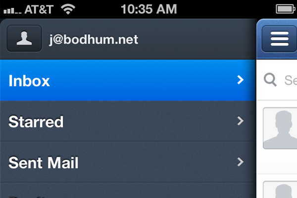
What strikes me about their navigation is the multi-system hierarchy. You can first tap on the top left button to open up a list of e-mail folders(inbox, archives, trash). But tapping again will bring up your complete list of e-mail accounts, which you can quickly switch between. You don’t see this type of side navigation implemented in any modern websites.
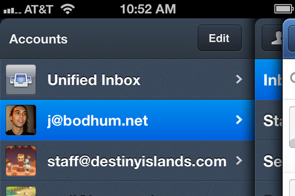
Each menu is animated as you switch between accounts and folders. The demonstration is so clean and organized, I was blown away my first use of the app! Screen clutter is basically non-existent since you can hide all the navigation links until they’re called upon. Try implementing a similar design with jQuery and you’ll see just how powerful a hidden navigation can be.
Bottom Tab Buttons
I have always loved Dribbble for the simplistic yet instinctual nature of their website layout. There have been a few mobile clients released for iPhone all based on recent Dribbble posts – and Shotz has to be one of my favorites. Their navigation system is located in the bottom tab bar portion of the screen.
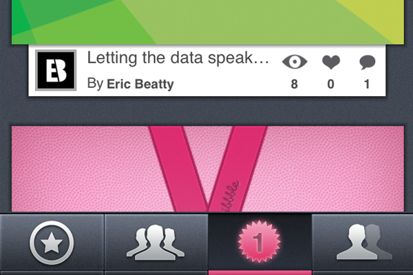
You can quickly flip through Dribbble shots pulled directly from the API in different areas. You can choose between popular shots, Debuts, everyone’s shots, and even your own profile shots. This navigation system is stupidly obvious to work with, which is always a good thing!
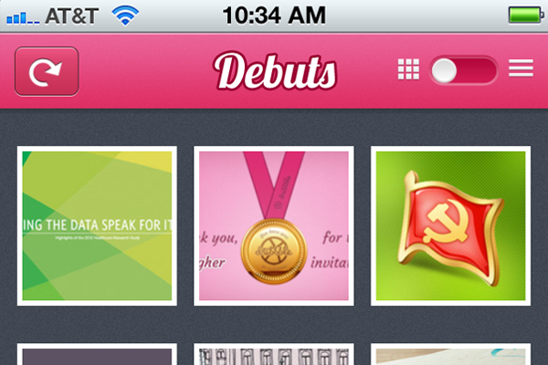
Another point to bring up is the switch button in the top-right corner. You can tap this input to change between thumbnail and detail view. It’s a really handy piece of functionality which developers have only just recently started to include. Websites have been using this idea for quite a while in e-commerce shops and blog post archives.
But you can understand how this organization technique is more helpful on specific mobile devices. Smaller screen real estate often leads to a much more cramped interface. But in this scenario you can give the option to your readers if they want to expand details or scroll through a smaller thumbnail gallery.
Build Around the Content
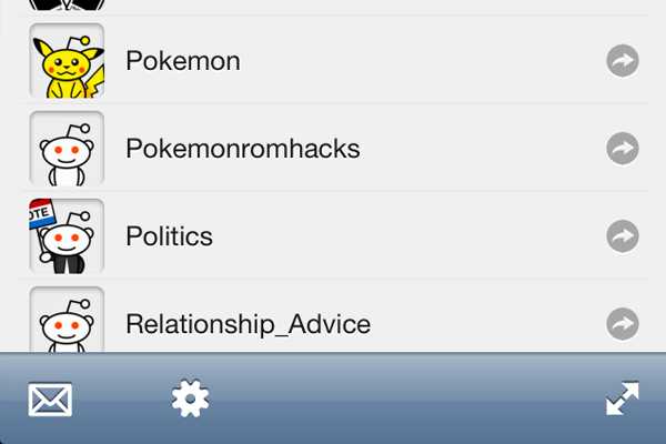
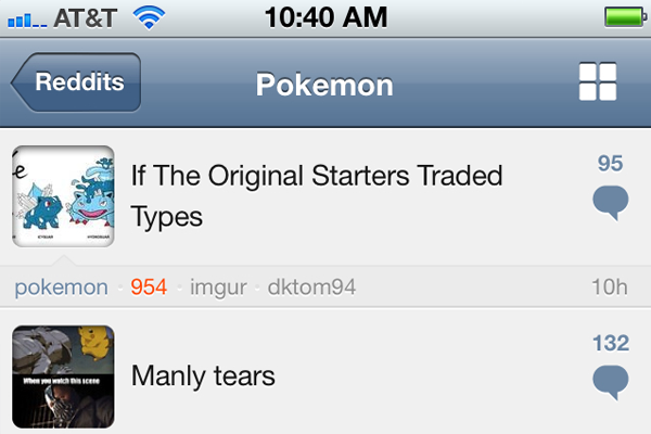
There are plenty of example navigation menus where the design is focused around specific content. The Reddit mobile client Alien Blue is often touted as one of the richest user experiences out of any iOS application. And I tend to agree where Reddit is such a minimalist website. The designers had no choice but to focus on content.
Yet again you have the option of viewing a longer list of stories or smaller post thumbnails. Reddit usually pulls some default photos which you can check out right from the listing screen. Tapping on the comments icon opens up a whole new area where you can sort comments by most recent, highest voted, and most controversial. These smaller sub-navigation buttons are based on context since they only apply to comments and stories in particular.
It’s also pretty simple getting through most of the default subreddits. You can choose to enter your own subreddit or choose from your subscriptions if you have an account. I think what makes Alien Blue so appealing is how the developer hasn’t gone back for major changes or completely redesigned the interface. Stick with what works while adding smaller tidbits here-and-there for increased performance.
It may be tough comparing your own navigation ideas towards some of the more professional app developers. But this is the best way to learn crucial techniques early in the design phase. Alien Blue stands out because you can fit a similar nav menu into almost any genre of mobile apps. Ultimately you want to build flexibly so your content will be wrapped in a simple UI.
Final Thoughts
I hope these ideas for mobile navigation will stick with you in upcoming projects. There will always be newer trends emerging and you’ll have to stay on top of your game to change with the industry. But there has never been a better time to start building your own ideas for mobile apps. Along with my examples feel free to share your ideas in the post discussion area below.