Thanks to some creative thinking, you can have a lovely and animated drop down menu done in CSS – no JavaScript required.
I personally think that this is very great as you are not required to know another language which is totally different from both HTML and CSS. On top of this, some users like to have JavaScript turned off which would not allow for this drop down effect to work at all. Because this is done via CSS there is no worry – it will work if JavaScript is disabled!
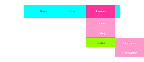
Below you can see the extent of the drop down that we will be creating. It is nothing extreme; it’s very straightforward actually. The great thing about this type of drop down, as you will see soon, is that it is very easy to add more to it if the need be. This is, after all, a simple tutorial that is meant to get you familiarized with the concept so that you can go all out with the navigation you need.
The HTML structure
Okay, let’s get to it! First of all, we want to create a simple container where the navigation will be housed in. Simple.
Now, let’s create the very base of the navigation starting with the newly introduced <nav> tag thanks to HTML5. Within it we’ll create the lovely unordered lists that will itself have three list items in it, the three main links: Home, About, Services.
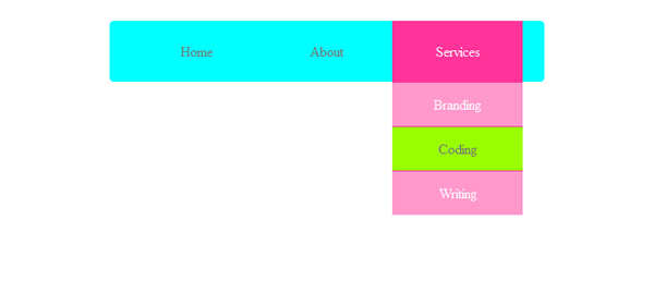
Moving on, we will add the remainder of the content. As you can see it is all based on unordered lists and list items so if you need to create a maze for your navigation you can – I would not recommend it though. Like in the very first image, you can see that under Services only the Writing link has another list of options for itself. This is to show you how to get the extra set of hierarchy in the drop down for pages further down in the website’s hierarchy.
The CSS looks
Now that this is all done with – which I hope was obviously simple- we need to make sure that the navigation actually looks good and works like it is meant to. Just because you have the actual links in order doesn’t mean there is a drop down of any kind going on; this is exactly where CSS comes in.
First, let’s style the container so that it places the navigation in the middle.
#container {
   width: 600px;
   margin: 0 auto;
}
Now, this may get a little bit confusing when it comes to selecting the elements. However, the first thing we want to do is disable the unordered lists within the original unordered list just so that by default we don’t see them there; this is the first step in achieving the drop down effect. Second, we want to make sure that when we hover over the list items of the first unordered list – the one housing everything – we want the unordered lists that are within the list items to show. In order to show them, we need to change the display property to block.
nav ul ul {
   display: none;
}

nav ul li:hover > ul {
   display: block;
}
Now, let’s style the default navigation look. What is happening in the code below is very easy to comprehend. We are setting the style of the navigation by giving it a background colour, by providing some padding, defining the width and height and adding some rounded corners. Next, we are adding a little hack that will make sure that the three main navigation links display properly, like a block.
nav ul {
   background: #0FF;
   padding: 0 25px;
   border-radius: 5px;
   position: relative;
   display: inline-table;
   list-style: none;
}

nav ul:after {
   content: "";
   clear: both;
   display: block;
}
The next thing on the list is the styling of the three main navigation links. What is happening is we want to make sure that the actual navigation is horizontal by floating the list items to the left. Additionally, we are setting their width so that they are all equal in size and centering the text for better visualization.
On top of that, we are setting the effect for these links when you hover over them. Basically, on hover we want the background to change and the text colour to change. I also threw in there a style for the links themselves to make sure that the links look nice as once you put an anchor around a text it messes it up a bit by giving it some default anchor values – we do not want those.
nav ul li {
   float: left;
   width: 150px;
   text-align: center;
}

nav ul li:hover {
   background: #F39;
}

nav ul li:hover a {
   color: #fff;
}

nav ul li a {
   display: block;
   padding: 25px 40px;
   color: #757575;
   text-decoration: none;
}
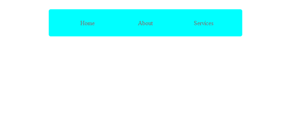
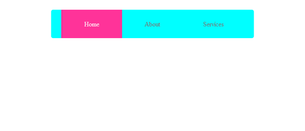
Below are the images of what you should have thus far for both default and hover states.
There is very little left so just bear with me here. We are going to style the drop down items now; they too need to look good. If you take a look at the code below you will find that there are a few things going on. First, I am setting the position of the unordered lists that are within the main list items so that they are specifically right under the respective list items. This is what is giving these lists the drop down effect. However, to help achieve the drop down look we need these items to look similar and alike, which is why they are getting the same width and background.
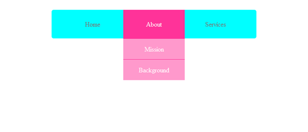
Before, we added some properties that by default would apply to these elements too, thanks to inheritance. As you can see we need some of them not to apply here which is why you see properties like border-radius and padding set to zero and float set to none.
As you can see there is a lot going on in the snippet below. We are setting the hover state for these drop down links and making sure once again that they look uniform and nice as a lot of these changes are cosmetic by now.
nav ul ul {
   border-radius: 0px;
   padding: 0;
   position: absolute;
   top: 100%;
   background: #F9C;
}

nav ul ul li {
   float: none;
   position: relative;
   border-top: 1px solid #F39;
}

nav ul ul li a {
   padding: 15px 0;
   color: #fff;
}

nav ul ul li a:hover {
   background: #9F0;
   color: #757575;
}
Okay, we have one more thing to do, which is to set the position of the third unordered list and its items once you hover over the item that has more to offer – in this case, Writing. As you saw in the example at the very top of what this drop-down is supposed to look like and the image below, the third level of links looks the same as the original drop down it is only placed to the left (like a lot of drop-down menus are). This third set of links is going to get its style by default from the style we set to the <ul> and <li> just before. The only thing we are setting differently is their location in relation to their parent.
nav ul ul ul {
   left: 100%;
   position: absolute;
   top: 0;
}
You’re done
I hope this tutorial was sweet and simple. I hope you enjoyed it and that you now know how to go about creating a sexy looking yet functional drop down menu for yourself. Like I said, you can go nuts if need be because it is very simple to add onto each link and place more links within it. But I would advise you to keep in mind usability principles when you do want to go nuts. I’d love for you to share links to screenshots or websites where you’ve created an awesome navigation yourself!
