This is a quick tutorial on creating a minimal, sticky, or fixed, navigation with CSS. Let’s get started right away!
We already posted quick tutorials teaching you how to create a simple pricing table, how to spice your buttons with transitions or create a simple CSS Pre-Loader.
Creating the HTML Structure
The most important part of this HTML document will be the navigation div itself. But let’s start with the basics.
[html]<html>
<head>
<style type=”text/css”>
</style>
</head>
<body>
</body>
</html>
[/html]
As you can see I will have my CSS as part of this HTML document. You should link to an external file but for the purpose of this tutorial I’ll keep things all in one place for ease and simplicity.
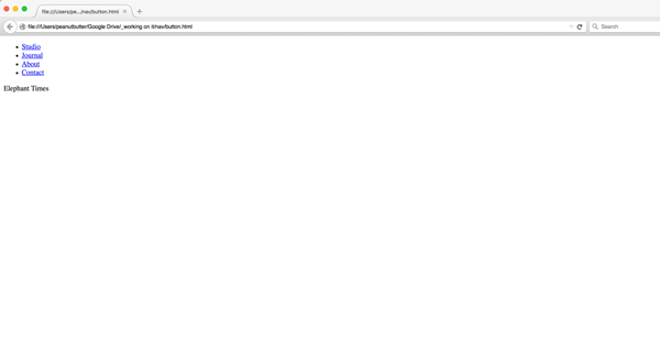
In the document, I want to add two things. The first is the navigation.
[html]<body>
<div id=”nav”>
<ul>
<li><a href=”#”>Studio</a></li>
<li><a href=”#”>Journal</a></li>
<li><a href=”#”>About</a></li>
<li><a href=”#”>Contact</a></li>
</ul>
<div id=”logo”>Elephant Times</div>
</div>
</body>
[/html]
Let’s talk about this for a minute. As you can see, this is a straightforward navigation. I have a div with an id of ‘nav’. Within it, there is an unordered list with some list items. Below the unordered list, is a div with a text logo. We will style all of those elements later.
The second thing I want to add to the HTML is some various backgrounds to show you that the nav is, in fact, sticky.
[html]<body>
<div id=”nav”>
<ul>
<li><a href=”#”>Studio</a></li>
<li><a href=”#”>Journal</a></li>
<li><a href=”#”>About</a></li>
<li><a href=”#”>Contact</a></li>
</ul>
<div id=”logo”>Elephant Times</div>
</div>
<div class=”box-1 bg”></div>
<div class=”box-2 bg”></div>
<div class=”box-3 bg”></div>
<div class=”box-1 bg”></div>
<div class=”box-2 bg”></div>
<div class=”box-3 bg”></div>
</body>
[/html]
As you can see this is pretty much nothing but it will get the job done for us as far as the sticky nav learning goes.
Adding the pretty CSS
CSS is what makes this nav sticky. But first let’s go over adding the styling of the page.
Importing Fonts
I want to use a font called Inconsolata from Google Fonts. Therefore, the first thing in my CSS is an import of that font.
[html]<style type=”text/css”>
@import url(https://fonts.googleapis.com/css?family=Inconsolata:400,700);
</style>
[/html]
Styling the Backgrounds
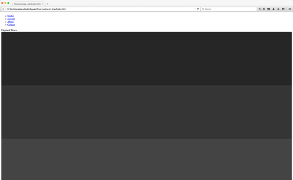
The second thing we added in the HTML were some empty background divs. I want to style them to look like gray rectangles solely so that when you scroll you can see the background change while the navigation stays still.
[css].bg {
width: 100%;
height: 350px;
min-height: 1em;
display: block;
}
[/css]
All of the six background divs had a .bg class on them. I want to use it to set the size of the divs. It’s useless to have the same code for each individual background div. It’s great practice to reuse a single class. That’s what they are for, after all.
[css].box-1 {
background: #262626;
}
.box-2 {
background: #353535;
}
.box-3 {
background: #444;
}
[/css]
I don’t know if you noticed in the HTML code, but although there were six divs there are only three box classes I’ve given them. I like to keep things simple for my tutorials; it’s useless to spend time thinking up colors when we are here to learn about sticky navigation. Anyhow, below is an image of what your browser should look like so far.
Getting the Navigation Setup
Okay, now the fun stuff. Let’s set up our font and text color so that the navigation will look a bit more appropriate.
[css]body {
font-family: ‘Inconsolata’, ‘courier new’;
color: white;
}
[/css]
Setting up the font and color could have been done on the ul or even li tags but then the logo would not be included in that style change. You’d have to do it again. You could also set it on the #nav but best practice is to set something like color and font on a broader scale such as the body tag. You’d set it on other tags to override it instead.
Did you catch the flaw in my previous attempt to define color? Simply defining text color, even globally, doesn’t take effect on anchor tags. That’s why I want you to add the below anchor declarations.
[css]a {
color: white;
text-decoration: none;
}
a:hover {
color: #262626;
background: #FCF474;
text-decoration: none;
}
[/css]
Wait, I can’t see the links…
[css]body {
font-family: ‘Inconsolata’, ‘courier new’;
color: white;
background: red;
}
[/css]
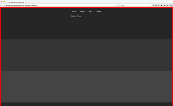
For the time being, I am going to add a red background to the body so that I can see the links. Right now if you were to refresh the page, you wouldn’t be able to see the links or the logo. We’ll get rid of it later.
Styling the Navigation
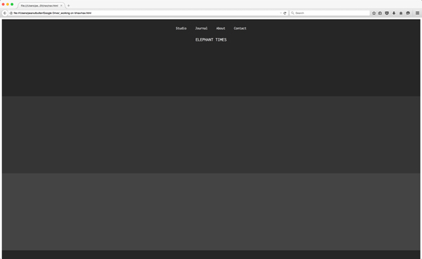
The first thing we should do in styling the navigation makes the link appear inline and not like a bulleted list. The below code does three things. First, it removes the styling and default spacing given by default to an unordered list and its items. Second, it places them in a single row via inline-block. Third, it adds my own spacing between the list items, aka my links.
[css]ul {
margin: 0;
padding: 0;
display: inline-block;
}
ul li {
list-style: none;
display: inline-block;
padding: 2em 0em;
}
[/css]

Better Hover States
A slight side note on improving the spacing of the navigation’s links. The current hover state changes the background color of the link to yellow. I think it would look a lot better if the hover state had more padding around it. So as you can see I added some padding to the anchor tags of 0.5em at the top and bottom of the anchor and 1em to its left and right.
[css]a {
color: white;
text-decoration: none;
padding: 0.5em 1em;
}
a:hover {
color: #262626;
background: #FCF474;
text-decoration: none;
padding: 0.5em 1em;
}
[/css]
Back to the navigation though
We need to do two things to the navigation, we need to make it fixed, and we need to center it on the page.
[css]#nav {
position: fixed;
left: 50%;
transform: translate(-50%, 0);
}
[/css]
The above code does both of those things. First, we use the position:fixed to fix the navigation in place. That’s pretty simple. Then we use transform to center the navigation. Because of the fixed proper, we can’t use the margin: 0 auto trick. We need to transform the element.
Don’t underestimate the importance of styling everything around the navigation in order to get it right. Additionally, the HTML structure is super important in order to get the right styling too.
And finally, the logo to top things off
Very quickly, the logo on this page looks a little odd. Let’s make it a little bigger than the links and center align it too.
[css]#logo {
text-align: center;
font-size: 1.25em;
text-transform: uppercase;
}
[/css]
A little styling can go a long way!
Conclusion
A fixed navigation is not that hard but it does take into consideration HTML and layout structure of the page. I hope this was an easy walkthrough to follow along. Now go forth and make some great sticky navigations! PS. you’re welcome to remove the red background from the body tag now.
