CSS layout mode is an algorithm that helps position and size elements based on their sibling and parent elements. There are actually six different layout modes.
There is the infamous table layout for tables or inline layout for texts. On top of that, there is the block layout which was originally intended for documentation styling, actually. The other two include position layout that helps place elements in relation to others as well as the grid layout which never really took off because it focused on a fixed grid. The last layout mode is the flexible box layout, or flexbox; it’s the only layout mode that was specifically implemented to optimize UI layouts.
The difference between block layout and flexbox is that block was intended to manipulate images and texts in relation to one another – think Word document editing on a webpage. Whereas flexbox is intended for flexibility – hence the name – of containers so that they take on the necessary shapes and sizes based on layout variations.
Browser Support
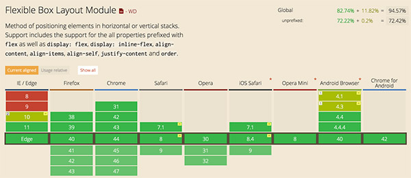
Browser support for this set of properties is astonishingly good. If you checkout flexbox on caniuse.com you’ll see that the property set has been supported by major browsers for a long time. Currently, even IE10 supports it fairly well. It’s even mobile friendly making flexbox so much more appealing, doesn’t it?
Basics of Flexbox
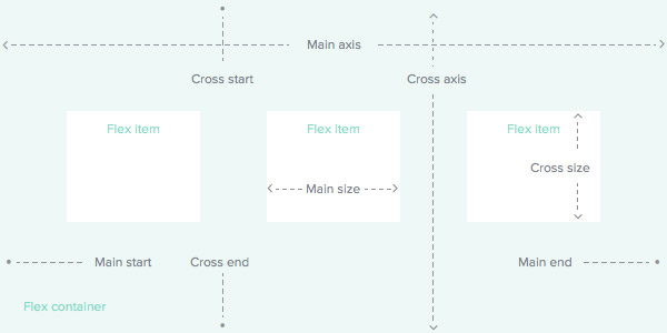
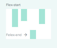
To get an understanding of how flexbox works, we need to first go over the way this new flow works. The image explains the overall idea behind flexbox pretty well as these concepts are self-explanatory. As you can see in the image above, items can be organized on either the main axis or the cross axis. The main axis is not always horizontal, though, you can define it to be vertical. The cross axis is perpendicular to the main axis; it’s horizontal if the main axis is vertical and vertical if the main axis is horizontal.
As you can also see in the image above there are containers and items meaning the flex container is the parent while the flex items are the children.
Setting up Flexbox
The very first thing you need to set up is a class for the parent and a class for the children. In most examples or tutorials, you’ll find these elements being called container and item, respectively, so we’ll do that too.
To initiate flexbox, you need to provide the display property of the parent container to be set to flex or inline-flex. The difference between the two is that flex creates a block level container while inline-flex creates an inline level one.
[css].container {
display: flex | inline-flex;
}
[/css]
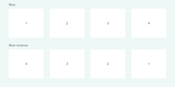
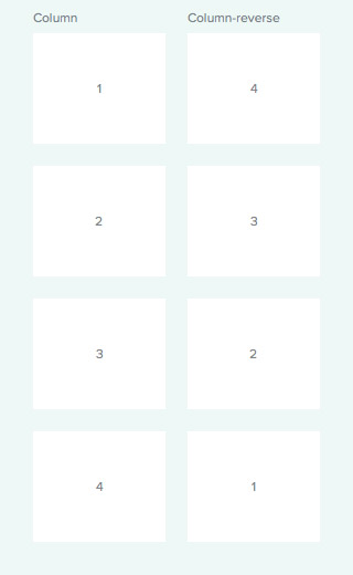
Flex-direction is how you define which is your main-axis. Row is left-to-right, row-reverse is right-to-left while column is top-to-bottom and column-reverse is bottom-to-top. Remember that if you set flex-direction to be row, it means that the cross axis is going to be column, and vice versa.
[css].container {
flex-direction: row | row-reverse | column | column-reverse;
}
[/css]
In order for flexbox to take effect make sure you have a few children items within your markup. Elements outside of the flexbox parent element, in our case the .container, will not be affected by flexbox and will render normally.
Styling the Parent Elements
Align-content
[css].container {
align-content: flex-start | flex-end | center | space-between | space-around | stretch;
}[/css]
In the simplest of terms this property aligns the rows of items within the container either to the top, bottom or the center of the container. Additionally, it can stretch rows to fill the full height of the container. It can also evenly space out rows thanks to the space-between and space-around settings.
Align-items
[css].container {
align-items: flex-start | flex-end | center | baseline | stretch;
}[/css]
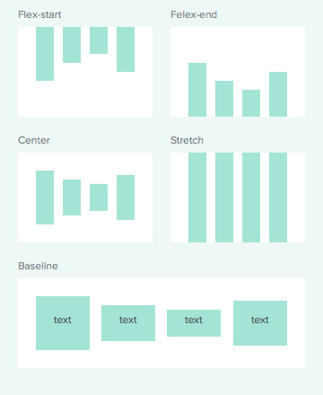
Align-items is intended to align items along the cross-axis. Flex-start means that the items will align to the start of the cross-axis, while flex-end means the items will align to the end of it. Center, as you’d imagine, means that the items will be either vertically or horizontally aligned depending on the flex-direction of the cross-axis. Stretch means that the items will be stretched from the cross-start to cross-end. Baseline is a little interesting, it means that the items will be aligned by their baselines no matter font variations.
Flex-wrap
[css].container{
flex-wrap: nowrap | wrap | wrap-reverse;
}[/css]
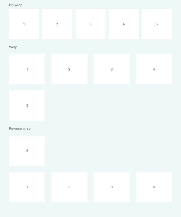
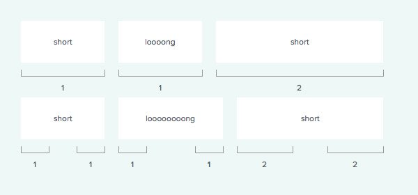
The default wrap setting in flexbox is ‘nowrap’ meaning that the items will try to fit into the container in a single line. You can allow wrapping of items if you want them to. If you want to play with the direction of the wrap you can by setting the wrap to be reverse. This means that the last, wrapped item, will show up first and before the remaining items.
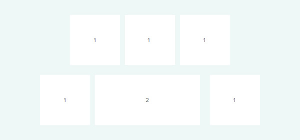
Justify-content
[css].container{
justify-content: flex-start | flex-end | center | space-between | space-around;
}[/css]
This property helps space items out in a container. The first three properties – flex-start, flex-end, center – act the same way that text-align does. Space between and space around are interesting concepts. Space between distributes the remaining space within the container like justifying text does in a text editor. Although this concept is something new, the ability of doing so with easy in CSS is amazing for content alignment.
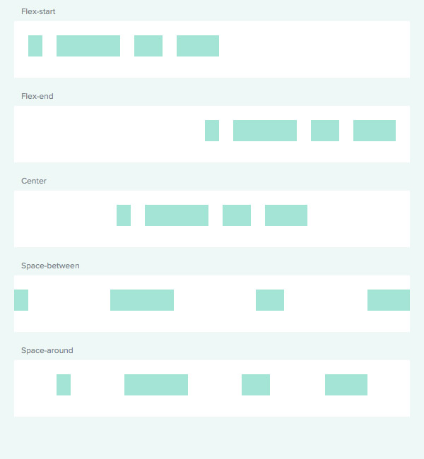
The last property type is space around. It works like space between but is also adds some space around the first and last items so they are not at the edge of the container.
Styling the Children
Now that we know what we can do to the elements on a parent level, let’s see what we can do with the individual children.
Align-self
[css].item {
align-self: auto | flex-start | flex-end | center | baseline | stretch;
}[/css]
You can override the parent align-item property for an individual item’s alignment. Float, clear and vertical-align do not affect flex items so you have to use align-self in order to realign a single item.
Flex-basis
[css].item {
flex-basis: | auto;
}[/css]
Overall, the main size of the item is determined by its width or height. This property distributes the space left in the container to the padding of the elements. The default state, auto, distributes the spacing accordingly to each item. but, if you set an element’s flex basis to 0, you’re eliminating its content space from being considered.
Flex-grow
[css].item {
flex-grow: ;
}[/css]
You can proportionally change the size of your items. The default setting is 0. The sizes are determined by the space available within the container.
Flex-shrink
[css].item {
flex-shrink: ;
}[/css]
You’re able to shrink the elements too, not just grow them. The default number is set 1 and it too works based on proportions and space available in the container.
Order
[css].item {
order: ;
}[/css]
Flex items are laid out by their source order, by default. However with the order property you can rearrange your items however you wish.
Overall Thoughts on Flexbox
Even though flexbox is a relatively new solution in displaying content, it’s taking off in popularity. that’s because so far, it’s been the only display property specifically designed to influence UI elements. Mind you, the web was originally designed to share scientific documentation, not visually complex websites.
It’s a great tool to help you move around and manipulate the layout of your content – its browser support is impressive and it’s easy to get the hang of. It’s no secret that web design is moving towards scalable and flexible designs which makes flexbox a very great tool for both designers and developers. It is definitely something worth playing around with especially because flexbox is only growing in popularity.
